-->

Saturday, August 30, 2014

How to Create Layout page and set for View: MVC

After creating default MVC application in Visual Studio there is a default layout file has been added in shared folder under views having name _Layout.cshtml. This file is used to provide consistent look on all of the pages having default layout page set. Changes done in this file will set for all the pages/views under this layout.

The above extension ".cshtml" is used only in case of Razor and this will be changed for aspx views. Programmer can even change this layout file as per requirements or can use multiple layout files according to the roles/group  defined. All the scripts, styles and custom files must be included in this layout file if necessary for all views.

If Programmer don't want to use any layout for the view then "Layout = null" must be set in the view page. This feature can only be set for that particular view. Now to create new layout file programmer have to add new item as "MVC Layout Page(Razor)" and change the name if required otherwise default will be used.

MVC set layout null


After adding the layout file create html and use “@RenderBody()” statement wherever you want to render the body of view page which will have this layout. Whatever change we do in this file, will be changed for all the views having this file as a layout.

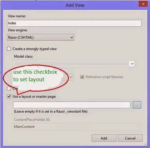
Whenever programmer adds a new view there is an option for using a layout or master file with a checkbox and browse button. Check that checkbox and browse for the layout file created above. This will set that file as a layout for that new view.

MVC set null in new view

Monday, April 14, 2014

StackPanel Overview in WPF

Layouts in WPF

WPF layout, a mostly used component of an application, is basically used to arranging controls on fixed pixels. Users can not resize the places which are placed in these layouts. There are five built-in panels i.e. Stack Panel, Canvas, Wrap Panel, Grid and Dock Panel resides in System.Windows.Controls namespace.


Stack Panel:

A very popular panel because of its simplicity and usefulness. As its name suggests it simply place its children into a stack. This panel is used in the same way as stacks in C programming. It places its children from the right/bottom most side, previous element will move when new one comes, and so on.


StackPanel in WPF

By default the orientation property of any stackpanel is vertical, if we want to show our contents in horizontal then we have to change the orientation of stackpanel. As in above diagram I have placed three button in both of the views one by one. By using simple code in xaml I can use a stack panel as in above window.
<StackPanel>
<Button Content="First " Width="70"></Button>
<Button Content="Second " Width="70"></Button>
<Button Content="Third " Width="70"></Button>
</StackPanel>
<StackPanel Orientation="Horizontal">
<Button Content="First " Height="50"></Button>
<Button Content="Second " Height="50"></Button>
<Button Content="Third " Height="50"></Button>
</StackPanel>
There are some cases in which we have to use nested stack panel like to show a person’s image and some information. 
<StackPanel>
<Image Source="...." Name="image"></Image>
<StackPanel >
<Label Content="Name"></Label>
<Label Content="Age"></Label>
<Label Content="Father Name"></Label>
</StackPanel>
</StackPanel>
Wrap panel

Wednesday, August 28, 2013

How to Design Better UI: Border Control in WPF

Whenever we use a control in our WPF window, it feels a simple look in our design view. Border control is used to draw a border around other control. Borders generally play an important role to generate a better UI for the application. It have some properties as other controls have like:

  • BorderBrush: used to specify color for the border.
  • BorderThickness: thickness of the border. By default it is zero.
  • CornerRadius: denote the degree to which the corner of border are rounded.
And many more common properties as WPF controls have like width, height, alignment properties, background, margin, padding and etc. Consider the following code
<Button Width="200" Height="30" Content="Button Without Border" Grid.Row="0"></Button>
<Border Width="200" Height="30" BorderThickness="2" BorderBrush="Aqua" Grid.Row="1" >
<Button Content="Button With Border"></Button>
</Border>

The first button doesn’t have any border so it will be simple in our window. Look out the second button surrounded by a border control. This border control have some properties assigned in above code. As we can see that in the second button, we did not provide width and height because it has been provided in the border control.

Run the above code and check the two buttons written in the above code:

Design Better UI with Border Control in WPF

Designing a same button with the same border can be easily performed with the following code.
Border border = new Border();
border.Height = 30;
border.Width = 200;
border.BorderBrush = Brushes.Aqua;
border.BorderThickness = new Thickness(2);
border.Child = new Button() { Content = "Button With Border" };
this.Content = border;

This code is also as same as written in the above xaml code. Run this code and a single but same button will be placed in WPF window.

Saturday, August 17, 2013

WPF: Alignments of Elements

In earlier post we have learnt about size-related properties i.e. Height & Width and Margin & Padding. In this article we will focus on alignments of elements. How a children should be positioned within a parent’s allocated space, is described by Alignment properties of an element.

There are two alignments i.e. Horizontal and Vertical and each one has its individual four values to be assigned.

Horizontal Alignment—Left, Center, Right and Stretch
Vertical Alignment—Top, Center, Bottom and Stretch

Each of these alignments have its own layout which is described below:

Left—Children are aligned to the left of parent’s allocated space.
Right—Children are aligned to the right of parent’s allocated space.
Top—Children are aligned to the top of parent’s allocated space.
Bottom—Children are aligned to the bottom of parent’s allocated space.
Center—Children are aligned to the center of parent’s allocated space.
Stretch—Children are stretched to fill the parent’s allocated space. Default value for alignments.

Place some buttons on a window and use above properties one by one and look out the effects of these alignments.
<Grid>
<Grid.RowDefinitions>
<RowDefinition/>
<RowDefinition/>
</Grid.RowDefinitions>
<StackPanel Grid.Row="0">
<Button HorizontalAlignment="Left">Button 1</Button>
<Button HorizontalAlignment="Center">Button 2</Button>
<Button HorizontalAlignment="Right">Button 3</Button>
<Button HorizontalAlignment="Stretch">Button 3</Button>
</StackPanel>
<StackPanel Grid.Row="1" Orientation="Horizontal">
<Button VerticalAlignment="Top" >Button 1</Button>
<Button VerticalAlignment="Center" >Button 2</Button>
<Button VerticalAlignment="Bottom" >Button 3</Button>
<Button VerticalAlignment="Stretch">Button 3</Button>
</StackPanel>
</Grid>
The preceding code yields a layout similar to the following screenshot. Positioning effects of both the alignments are visible.
Element's Horizontal and Vertical Alignment in WPF

Margin and Padding of Elements: WPF

In our previous post we have set Height and Width properties of an element, now we will set the next size related properties i.e. Margin and Padding. Margin controls how much extra space gets placed around the outside edges of the element, whereas padding controls around the inside edges of the element.

Margin and Padding can be assign in following simple ways:
  • Margin = "10", same margin of all four sides.
  • Margin = "10,5", 10 for left & right, 5 for top & bottom.
  • Margin = "10,5,10,5", for left, top, right and bottom respectively.
Same can be used for padding. Here is xaml code with three buttons having some margins.
<StackPanel Orientation="Horizontal">
<Button Margin="10">Button 1</Button>
<Button Margin="20,5">Button 2</Button>
<Button Margin="20,15,20,15">Button 3</Button>
</StackPanel>
As padding controls around the inside edges of the element, I have used a border across each button:
<StackPanel Orientation="Horizontal" Height="60">
<Border Background="Aqua" BorderThickness="2">
<Button Padding="10">Button 1</Button>
</Border>
<Border Background="Aqua">
<Button Padding="10,15">Button 2</Button>
</Border>
<Border Background="Aqua">
<Button Padding="20,15,20,15">Button 3</Button>
</Border>
</StackPanel>
The effect of padding will look like in the following screenshot:

Margin and Padding of Elements in WPF

Varying the values of these margins and paddings, we can measure the changes. If one want to use all these margins through code behind then we have to use Thickness class like the below code:
Button button1 = new Button();
button1.Margin = new Thickness(10);
button1.Margin = new Thickness(20, 15, 20, 15);

As we can see that either we can use a single value or all the four values to use margin property of an element. There is no option to use the second type i.e. the one for left & right and one for top & bottom.

Alignments and Height & Width

Friday, August 16, 2013

How to set Height and Width of Elements: WPF

Panels, also called parent elements, supports multiple child elements to be arranged in it. Parents decide about where to render and how much space the children get. WPF elements tend to size to their content that is to be done through its SIzeToContent property.

Height & Width:

There are several properties which are used for layouts of an element, some are size related and some are position related. Size related properties includes height, width, margin and padding. Position related properties includes horizontal & vertical alignment.

All the elements have height and width properties and also they have MinHeight, MinWidth, MaxHeight, MaxWidth to specify the values. Height/Width property is used to get or set the suggested height/width of the respective element.

We can create a textblock with height(100) and width(200) using the below xaml code.
<TextBlock Text="Hello World" Height="100" Width="200" Background="Black"/>
The above code may be written like the below code as we have discussed in our “earlier post”.
<TextBlock>
<TextBlock.Text>Hello World</TextBlock.Text>
<TextBlock.Height>100</TextBlock.Height>
<TextBlock.Width>200</TextBlock.Width>
<TextBlock.Background>Black</TextBlock.Background>
</TextBlock>
The textblock looks like as the following screenshot:

Height and Width property of an element in WPF

Element also contains some more size-related properties like DesiredSize, RenderSize, ActualHeight and ActualWidth. RenderSize represents the final size of an element, and ActualWidth and ActualHeight are exactly same as the final width and final height of an element. DesiredSize is used when IsMeasureValid property is true for an element.

Alignments and Margin & Padding

Monday, August 12, 2013

Use Canvas Panel Control in WPF

Canvas is the basic panel. One can simply place children in a canvas with its attached properties left, top, right and bottom. One should have some knowledge of graph paper to use a canvas panel in WPF. This works as margin property of an element.

I have placed some buttons in a canvas as in following image:


The buttons in above image can be simply placed by using following xaml code:
<Canvas>
<Button Content="First" Canvas.Left="10" Canvas.Top="10"></Button>
<Button Content="Second" Canvas.Top="10" Canvas.Right="10"></Button>
<Button Content="Third" Canvas.Bottom="50" Canvas.Right="50"></Button>
</Canvas>

It is the most lightweight panel for creating flexible user interfaces. One should keep it in mind for maximum performance when one need precise control over the placement of elements. A child can use only two of the canvas attached properties at a time, remaining will be ignored. It means one cant dock an element to more than one corner of a canvas.

Grid Panel Overview in WPF

When a window is added to WPF project then grid is added by default having zero children. It is most often used panel in compare to dock panel, stack panel and other panels. Grid provides no of rows and columns which enables you to arrange the elements without wrapping, stacking. It is like table in programming where we can add no of rows and columns as required.
<Grid>
<Grid.RowDefinitions>
<RowDefinition/>
<RowDefinition/>
</Grid.RowDefinitions>
<Grid.ColumnDefinitions>
<ColumnDefinition/>
<ColumnDefinition/>
</Grid.ColumnDefinitions>
</Grid>
We have to specify the position of each child using either Grid.Row or Grid.Column property of each child in this grid. If we not then it will place all the children in first cell by default.


Grid cells can be either left empty or multiple elements can also be placed in a single cell. Other panels like stack panel or wrap panel can also be used in the grid. Resizing the rows or columns can also be done using Grid Splitter. All this can be also performed by using code behind file.

Grid provides many more in-built functions like sharing width of a column, resizing cells, adding controls to grid and many more.
Canvas panel
© Copyright 2013 Computer Programming | All Right Reserved