-->

Thursday, April 9, 2015

How to use app bar in windows store app

Introduction

App bar is a container, which is contain items on it, such as AppBarButtton, AppBarToggleButton, and AppBarSeparator. You can put an app bar at the top of the page, at the bottom of the page, or both. If you want to use app bar, right click on window screen or press window+Z because App bar is hidden by default.

How to add App bar into your application

Step-1 : Assign a AppBar control to the TopAppBar or BottomAppBar property of a Page. like

<Page.TopAppBar>
    <AppBar>
        <!-- Place control here like AppBarButton -->
    </AppBar>
</Page.TopAppBar>

Step-2 : If you want to add App Bar at Bottom, must Assign a AppBar control to the BottomAppBar property of a Page, like


<Page.BottomAppBar>
   <AppBar>
        <!-- Place control here like AppBarButton -->
    </AppBar>
</Page.BottomAppBar>

Let's take an simple example, App Bar with Refresh button

<Page.TopAppBar>
        
        <AppBar>
            
            <AppBarButton Label="refresh" Icon="Refresh" Click="AppBarButton_Click" />
        </AppBar>
    </Page.TopAppBar>

Code Generate the following output

How to use app bar in windows store app

How to customize GroupedItemsPage in windows store Grid app

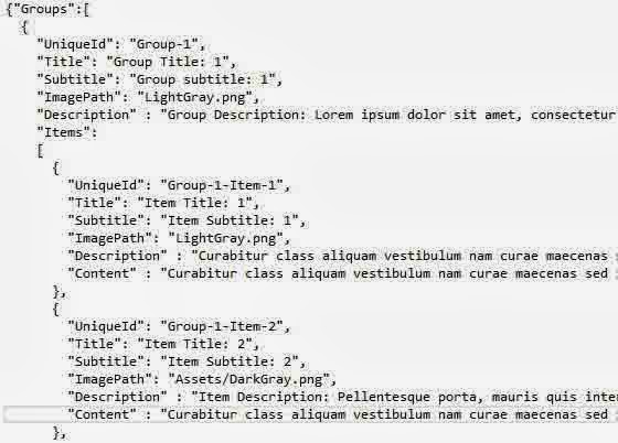
In previous article, we have already seen about GroupItemsPage. Now, if you want to customize it. Your data source file exist in DataModel folder. Open SampleData.Json file , which is inside in it. Your file look like.

How to customize GroupedItemsPage in windows store Grid app
If you run this code , default output will appear on your window screen. Look Like

How to customize GroupedItemsPage in windows store Grid app

Change first Group1-item1 picture using above mentioned file. You can change here, for change Item image , which is shown in first tile.

    {
        "UniqueId": "Group-1-Item-1",
        "Title": "Item Title: 1",
        "Subtitle": "Item Subtitle: 1",
        "ImagePath": "LightGray.png",
        "Description" : "Curabitur class aliquam vestibulum nam curae maecenas sed integer cras phasellus",
        "Content" : "About first "
      }, 

Change ImagePath for changing image. Before change , must take single image file into your solution explorer.
After change your code will look like

    {
        "UniqueId": "Group-1-Item-1",
        "Title": "Item Title: 1",
        "Subtitle": "Item Subtitle: 1",
        "ImagePath": "jacob.jpg",
        "Description" : "Curabitur class aliquam vestibulum nam curae maecenas sed integer cras phasellus",
        "Content" : "About first "
      },

How to customize GroupedItemsPage in windows store Grid app

How to use TimerPicker control in Windows store app

Introduction

User can pick time easily by the TimerPicker control. You can give input in it by touch, mouse, and keyboard. It is divided in two different interval, such as AM and PM. It is take 24Hourclock bydefault. If you want to show "am" and "pm" with default TimerPicker control, should set ClockIdentifier is 12HourClock.

Default view of Timer Picker control

  <TimePicker HorizontalAlignment="Left" Margin="230,275,0,0" VerticalAlignment="Top"/>

Default view of TimerPicker control in windows store app

After set ClockIdentifier property in TimerPicker control

<TimePicker ClockIdentifier="12HourClock" HorizontalAlignment="Left" Margin="230,275,0,0" VerticalAlignment="Top"/>

After set ClockIdentifier property in TimerPicker control

Example of Time property of TimerPicker control

<TimePicker Time=" 12:00:00" ClockIdentifier="12HourClock" HorizontalAlignment="Left" Margin="230,275,0,0" VerticalAlignment="Top"/>


Example of Header property of TimePicker control

<TimePicker Header="This is you time" Time=" 12:00:00" ClockIdentifier="12HourClock" HorizontalAlignment="Left" Margin="230,275,0,0" VerticalAlignment="Top"/>

Example of Header property of TimePicker control

Example of IsEnabled property of TimerPicker Control

Example of IsEnabled property of TimerPicker Control
© Copyright 2013 Computer Programming | All Right Reserved