-->

Friday, August 23, 2013

ColorDialogBox Control in Windows Forms

Common dialog class is the base class for displaying common dialog boxes. One can access these boxes like Font dialog box, Open dialog box, Print dialog box etc. by using inherited classes of this base class. All these inherited classes overrides RunDialog() method which is automatically called when user calls the ShowDialog() method.

Color Dialog Box

To change the color of anything you want like text color, background color or foreground color of any control dynamically, we can use color dialog box. A simple look on color dialog box:

Preview of color Dialog Box

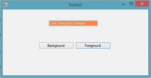
To add this box just drag-n-drop color dialog control from the toolbox. Add a textbox and two buttons on the form with text property background and foreground respectively as shown in the following image:


Write the following code snippet (C# language) in click event of both button respectively:
private void backgroundButton_Click(object sender, EventArgs e)
{
colorDialog1.ShowDialog();
textBox1.BackColor = colorDialog1.Color;
}
private void foregroundButton_Click(object sender, EventArgs e)
{
colorDialog1.ShowDialog();
textBox1.ForeColor = colorDialog1.Color;
}
Now look out the text box, it have been changed its background color to and also foreground color as shown in following image.


So it is so easy to change color of any control’s background or foreground property.

FontDialogBox Control

Error Provider Control in Windows Forms

When using validation, programmer should have notify a message if there is a problem with the input entry. That notification can be shown using message box, status label control etc. The one more control to notify an error message to user is error provider control.

Error provider control can be used to display an error message, whenever the user positions the mouse pointer over the error icon. To add an error provider control, you can drag-n-drop it from the toolbox to the form. Some of the properties of this control are:
  • BlinkStyle: whether the error icon blinks or not when an error is set.
  • BlinkRate: rate at which the error icon blinks.
  • ContainerControl: contains the controls on which this control can display icons.


Here are some methods which are mostly used with error provider:
  • Clear(): clear all the errors associated with it.
  • GetError(): returns current error string for the specified control.
  • SetError(): set the error for specified control.
To set an error for a textbox when user left empty, drag-n-drop a textbox, button and an error provider control on a form. On the click event of button write following code in C# language:
if (textBox1.Text == string.Empty)
{
textBox1.Focus();
errorProvider1.SetError(textBox1, "This may not be Empty");
}
When we run the form and click on the button without writing anything in the textbox, then an error icon will blink just after the textbox with a message shown as a tool tip of the icon.

Error provider control in windows forms C#

Here in the code a method SetError() have been used, it takes two parameters, one for the control (to which error will be associated) and the second for the message to be shown. A single error provider can easily be used with more than one control.

Thursday, August 22, 2013

XNA Game : SquareChase

The Basic Aim of the Game
In SquareChase , we will generate randomly positioned squares of different colors while the user attempt to catch them with their mouse pointer before they disappear .

System requirements of the project
First you need to install visual c# 2010 and XNA framework extensions.Your system has support graphics card (Shader Model 1.1 Support, Direct X 9.0 support)

How to design the game
First you need to initialize the graphics object in your XNA Game class constructor.

graphics = new GraphicsDeviceManager(this);
Content.RootDirectory = "Content";

Make the mouse pointer visible by adding the following before the call to 

base.Initialize();

this.IsMouseVisible = true;

here is the one override Initialize()  method is to call LoadContent() when the normal initialization has completed. The method is used to read in any graphical and audio resources your game will need.

Screenshot of the game
XNA Game : SquareChase

Project Source code


Wednesday, August 21, 2013

Status Strip Container Control in Windows Forms

StatusStrip container control is used to display objects that are on the current form and also to provide feedback on the progress of any progress of any operation being performed by the form. Some of the properties of this container control are:
  • Items: collection of items to be displayed on the control.
  • LayoutStyle: specifies the layout orientation of the control.
  • Dock: defines the border of control which will bind to the parent control.
Status strip control contains four child controls that can be placed as and when required. The child controls are:

Status Label Control

Works as a Label control. Used to display status information and prompt the user for a valid entry. It has some properties to be used by programmer like
  • Text: text to be displayed on the control.
  • Spring: whether the item fills up the remaining space or not. It is a Boolean type property.
  • TextAlign: specify the alignment of the text.

ProgressBar Control

Used to show the status of the task performing by the user. Represent window progress bar control. Some properties of this control are:
  • Minimum: lower bound of the range.
  • Maximum: upper bound of the range.
  • Value: current value to be set on this control.
  • Step: value to be increment/decrement.

DropDown Button Control

Displays toolStripDropDown from which user can select one item at a time. Generally used when the items to be displayed on StatusStrip cannot be accommodated. Some of the properties of this control are:
  • DisplayStyle: whether the text or image to be displayed.
  • DoubleClickEnabled: whether the double click event will occur.
  • DropDownItems: specifies the toolStripItem when the item is clicked.

SplitButton Control

It is a combination of a standard button and a drop-down button on the left and right respectively. Some of the properties are:
  • DisplayStyle: whether the text or image to be displayed.
  • DoubleClickEnabled: whether the double click event will occur.
  • Padding: internal spacing within the item.
The following image shown all the four controls of the StatusStrip control.

StatusStrip Container control in windows forms

Error Provider Control

Tuesday, August 20, 2013

ASP.NET : How to use Link Button control

The LinkButton control is another standard Web server control used to link the current Web page to some other Web page, similar to the HyperLink control. The only difference between the two is that the HyperLink control just allows the browser to navigate to a new Web Page, whereas in the LinkButton control, we can also perform some other action by handling the click and Command events of this control.

Use of the LinkButton control
  • Best use in Signin/Signout button
  • Design horizontal/vertical menu bar 
  • In bulleted list 
  • Define product category
Snapshot of the link button control
Account setting link button

SignOut Example of LinkButton

<%@ Page Language="C#" %>
<!DOCTYPE html>

<script runat="server">

    protected void LinkButton1_Click(object sender, EventArgs e)
    {
        Session.Abandon();
        Response.Redirect("Default.aspx");
    }
</script>

<html xmlns="http://www.w3.org/1999/xhtml">
<head runat="server">
    <title></title>
</head>
<body>
    <form id="form1" runat="server">
    <div>
        <asp:LinkButton ID="LinkButton1" runat="server" OnClick="LinkButton1_Click">SignOut</asp:LinkButton>
    </div>
    </form>
</body>
</html>

Output
signout link button

Monday, August 19, 2013

Passing Values from DataGridView between Different Forms

Sometimes we need to transfer all the rows and columns of a DataGridView from one form to another. In this article I will transfer all the binded data of first form's grid view and bind them to second form's grid view.

Create two forms with dataGridView in each and a button on first form. Create a class to which your datagridview will bind like i create a student class having Name, Age and address field.
Bind the first form's gridview in C# language as
studList.Add(new Student() { Name = "Jacob", Age = 23, Address = "London" });
studList.Add(new Student() { Name = "Jaklin", Age = 25, Address = "US" });
studList.Add(new Student() { Name = "Julia", Age = 26, Address = "UK" });
dataGridView1.DataSource = studList;

In the click event of button write the following code in C# language
List<Student> tempList = dataGridView1.DataSource as List<Student>;
new Form1(tempList).ShowDialog();

And your second form's constructor have to look like the below code in C# language
public Form1(List<Student> sourceList)
{
InitializeComponent();
dataGridView1.DataSource = sourceList;
}
When we run this project and click on transfer button then both the form have same list of data e.g.

So we have passed all the rows and columns of first form's gridview to second form's gridview.

Windows Store Apps : Write simple Hello world

Getting started with windows store
Step-1: Download windows 8 sdk from Microsoft website
http://msdn.microsoft.com/en-us/library/windows/desktop/hh852363.aspx

Step-2: Select Windows store Apps from file-->New-->Project-->Visual C# -->Windows store

start screen of Windows Store Apps : Write simple Hello world

Step-3: Select "MainPage.xaml" file in solution explorer.

You can make use of the TextBlock control for displaying Text on the screen.The TextBlock control has a property called Text that you can set to "Hello World" after press button.

Step-4: Paste this code into your "MainPage.xaml" file


<Page
x:Class="Helloworld.MainPage"
xmlns="http://schemas.microsoft.com/winfx/2006/xaml/presentation"
xmlns:x="http://schemas.microsoft.com/winfx/2006/xaml"
xmlns:local="using:Helloworld"
xmlns:d="http://schemas.microsoft.com/expression/blend/2008"
xmlns:mc="http://schemas.openxmlformats.org/markup-compatibility/2006"
mc:Ignorable="d">

<Grid Background="{StaticResource ApplicationPageBackgroundThemeBrush}">
<Button Content="Press Me" HorizontalAlignment="Left" Margin="94,76,0,0" VerticalAlignment="Top" Width="192" Height="71" Click="Button_Click_1"/>
<TextBlock x:Name="label1" HorizontalAlignment="Left" Margin="94,175,0,0" TextWrapping="Wrap" Text="" VerticalAlignment="Top" Height="85" Width="211"/>

</Grid>
</Page>
Codebehind file
using System;
using System.Collections.Generic;
using System.IO;
using System.Linq;
using Windows.Foundation;
using Windows.Foundation.Collections;
using Windows.UI.Xaml;
using Windows.UI.Xaml.Controls;
using Windows.UI.Xaml.Controls.Primitives;
using Windows.UI.Xaml.Data;
using Windows.UI.Xaml.Input;
using Windows.UI.Xaml.Media;
using Windows.UI.Xaml.Navigation;


// The Blank Page item template is documented at http://go.microsoft.com/fwlink/?LinkId=234238


namespace Helloworld


{
 
/// <summary>
/// An empty page that can be used on its own or navigated to within a Frame.
/// </summary>
public sealed partial class MainPage : Page


{
 
public MainPage()


{
 
this.InitializeComponent();


}
 
/// <summary>
/// Invoked when this page is about to be displayed in a Frame.
/// </summary>
/// <param name="e">Event data that describes how this page was reached. The Parameter
/// property is typically used to configure the page.</param>
protected override void OnNavigatedTo(NavigationEventArgs e)


{

}
 
private void Button_Click_1(object sender, RoutedEventArgs e)


{
 
label1.Text = "Hello world!";


}

}

}
 
 
Output
Windows Store Apps : Write simple Hello world
© Copyright 2013 Computer Programming | All Right Reserved