-->

Monday, September 2, 2013

How to use Calendar Control in ASP.NET

The Calendar Control

The Calendar control display a graphic calendar on which users can select dates. This control exists within System.Web.UI.WebControls namespace. You can use the Calendar control to display a single month of a calendar on a Web page . This control allows you to select dates and move to the next or previous month. By Setting the SelectionMode property , You can select a single day , week, or month.
By Default , the control displays the days of the month , day headings for the of the week , a title with the name of the month , and arrow characters for navigating to the next and previous months. You can customize the appearance of calendar control by setting the properties that control the style for different parts of the control.

Example of Calendar Control

<%@ Page Language="C#" %>

<!DOCTYPE html>

<script runat="server">


    protected void Calendar1_SelectionChanged(object sender, EventArgs e)
    {
        TextBox1.Text = "selected date is " + Calendar1.SelectedDate;
    }

    protected void Page_Load(object sender, EventArgs e)
    {
        Calendar1.SelectedDate = DateTime.Now;
     
    }
</script>

<html xmlns="http://www.w3.org/1999/xhtml">
<head runat="server">
    <title></title>
</head>
<body>
    <form id="form1" runat="server">
    <div>
        <asp:Calendar ID="Calendar1" runat="server" BackColor="#FF6600" BorderColor="#336600" BorderStyle="Solid" BorderWidth="2px" Caption="Select date and month" DayNameFormat="Full" OnSelectionChanged="Calendar1_SelectionChanged" ShowGridLines="True" Width="459px"></asp:Calendar>
        <br />
        <asp:TextBox ID="TextBox1" runat="server" Height="26px" Width="203px"></asp:TextBox>
        <br />
    </div>
    </form>
</body>
</html>


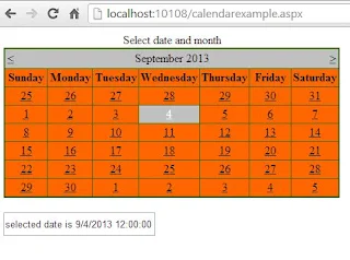
Output
How to use Calendar Control in ASP.NET
Here some initialized properties are:
Caption : Obtains or sets a text value that is rendered as a caption for the calendar control.
ShowGridLines : Obtains or sets a value indicating whether the heading for the days of the week is displayed.
DayNameFormat : Obtains or sets the name format for the days of the week .

Dynamically Enable or Disable ASP.NET Controls

If your controls are enable then you take some action onto the controls such as checked or unchecked CheckBox and If they are disable then you don't take some action onto the controls.
In previous example we saw checked property of checkbox control .

Example of Dynamically Enable or Disable ASP.NET Controls


<%@ Page Language="C#" %>

<!DOCTYPE html>

<script runat="server">

    protected void Button2_Click(object sender, EventArgs e)
    {
        Button1.Enabled = true;
        CheckBox1.Enabled = true;
        RadioButton1.Enabled = true;
        TextBox1.Enabled = true;


    }

    protected void Button3_Click(object sender, EventArgs e)
    {
        Button1.Enabled = false;
        CheckBox1.Enabled = false;
        RadioButton1.Enabled = false;
        TextBox1.Enabled = false;

    }
</script>

<html xmlns="http://www.w3.org/1999/xhtml">
<head runat="server">
    <title></title>
</head>
<body>
    <form id="form1" runat="server">
    <div>
        <asp:Button ID="Button1" runat="server" Text="Button Control" />

        <br />
        <br />
        <asp:CheckBox ID="CheckBox1" runat="server" Text="CheckBox Controls" />
        <br />
        <br />
        <asp:TextBox ID="TextBox1" runat="server" Width="164px">TextBox Control</asp:TextBox>
        <br />
        <br />
        <asp:RadioButton ID="RadioButton1" runat="server" Text="Radio Button Control" />
        <br />
        <br />
        <br />
        <asp:Button ID="Button2" runat="server" OnClick="Button2_Click" Text="Controls Enable" />
&nbsp;
        <asp:Button ID="Button3" runat="server" Text="Controls Disable" OnClick="Button3_Click" />

    </div>
    </form>
</body>
</html>

Output
Dynamically disable controls Dynamically Enable controls


How to use Checked property of CheckBox Control

Checked property is shows that your checkbox is either checked or not .Take a one example for showing image when your checkbox is checked. algorithm of the example are:
-->Drop one CheckBox control to Webpage
-->Set AutoPostBack property is true. Because when your CheckBox is checked then your page request send to the server . After server response your business logic event handler should executed.

Example of Showing Image when your CheckBox is checked.


<%@ Page Language="C#" %>

<!DOCTYPE html>

<script runat="server">

    protected void Page_Load(object sender, EventArgs e)
    {

    }

    protected void CheckBox1_CheckedChanged(object sender, EventArgs e)
    {
        if (CheckBox1.Checked)
        {
            Image1.Visible = true;
        }
        else
        {
            Image1.Visible = false;
        }
     
     
    }
</script>

<html xmlns="http://www.w3.org/1999/xhtml">
<head runat="server">
    <title>Checked Property</title>
</head>
<body>
    <form id="form1" runat="server">
    <div>
        <asp:CheckBox ID="CheckBox1" runat="server" AutoPostBack="True" Text="Show Image" OnCheckedChanged="CheckBox1_CheckedChanged" />
        <br />
        <asp:Image ID="Image1" runat="server" Height="161px" ImageUrl="~/download.jpg" Visible="False" Width="175px" />
    </div>
    </form>
</body>
</html>

Output
How to use Checked property of CheckBox Control

Sunday, September 1, 2013

How to get Multiple selected listbox item in ASP.NET


<%@ Page Language="C#" %>

<!DOCTYPE html>

<script runat="server">

    protected void ListBox1_SelectedIndexChanged(object sender, EventArgs e)
    {
        foreach (ListItem li in ListBox1.Items)
        {
            if (li .Selected )
            {
                result.Text += li.Text + "<br/>";
                 
            }
        }
    }
</script>

<html xmlns="http://www.w3.org/1999/xhtml">
<head runat="server">
    <title></title>
</head>
<body>
    <form id="form1" runat="server">
    <div>
        <asp:ListBox SelectionMode ="Multiple" ID="ListBox1" runat="server" AutoPostBack="True" OnSelectedIndexChanged="ListBox1_SelectedIndexChanged">
            <asp:ListItem>Your first item</asp:ListItem>
            <asp:ListItem>Your Second Item</asp:ListItem>
            <asp:ListItem>Your Third item</asp:ListItem>
        </asp:ListBox>
        <br />
        <br />
        <asp:Label ID="result" runat="server" Text=""></asp:Label>
    </div>
    </form>
</body>
</html>

Output
How to get Multiple selected listbox item in ASP.NET

Online camera shopping cart project in ASP.NET

Introduction

Its a shopping cart project which is used over the network. Present time online shopping companies get benefits from online selling because they getting lots of money compare to manual marketing. The scene of the project is making online application which is used for online shopping. Basically this application is designed for camera only also its a demo application.


Application of the project

  • Gets some extra cash from online selling
  • Application is designed for Institutional purpose
Features of the project
  • Add new category and sub-category of the camera
  • User registration page
  • Online cashing
  • Searching facility
  • User session
  • Add to cart facility
  • Admin panel
  • Customer panel

Hardware and software requirements of the project

  • Visual studio 2010
  • SQL-SERVER 2008

How to run your project

  • Open your project in VS2010
  • Run your home page
  • First register into this site
  • After that click on any camera which you want to purchase
  • Add quantity and add item to the cart
  • In admin panel first check your admin password in server explorer 
  • Add new camera detail after login into Admin panel


If you want to purchase this please contact me on :  narenkumar851@gmail.com

Silverlight Tutorial : Create Simple Silverlight Application

The easiest way to start Silverlight is to create an ordinary website with HTML pages and no server-side code . Here's how
1. Select File--> New-->Project in visual studio , choose the visual c# group of project types, and select the Silverlight Application template . As usual , you need to pick a project name and a location on your hard drive before clicking OK to create the project.

Silverlight Application template

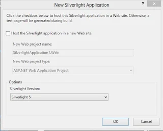
2. At this point , visual studio will prompt you to choose whether you want to create full -fledged ASP.NET website that can run server-side code along with your silverlight . In visual studio , uncheck the "Host the Silverlight application in a website" option to keep things simple.
 uncheck the "Host the Silverlight application in a website

3. Click OK to continue and create the project.
Every Silverlight project start with a small set of essential files. All the files that end with the extension .xaml use a flexible markup standard called XAML. All the files that end with the extension .cs hold the C# source code that powers your application.
Every Silverlight project start with a small set of essential files
App.xaml and App.xaml.cs files configure your Silverlight application they allow you to resources that will be made available to all the pages in your application, and they allow you to react to application events such as startup, shutdown and error conditions.

MainPage.xaml files defines the user interface(the collection of controls, images, and text) that will be shown for your first page. Technically , Silverlight pages are user controls-custom classes that drive from UserControl. A Silverlight application can contain as many pages as you need - to add more , simply choose project-->Add new item, pick the silverlight User Control template.

Example of Create Simple "Hello World Application" in  Silverlight 

<UserControl x:Class="SilverlightApplication1.MainPage"
    xmlns="http://schemas.microsoft.com/winfx/2006/xaml/presentation"
    xmlns:x="http://schemas.microsoft.com/winfx/2006/xaml"
    xmlns:d="http://schemas.microsoft.com/expression/blend/2008"
    xmlns:mc="http://schemas.openxmlformats.org/markup-compatibility/2006"
    mc:Ignorable="d"
    d:DesignHeight="300" d:DesignWidth="400">


    <Grid x:Name="LayoutRoot" Background="Black">
        <TextBox Text=" Hello World!" HorizontalAlignment="Left" Height="23" TextWrapping="Wrap" VerticalAlignment="Top" Width="120"/>


    </Grid>
</UserControl>


Output
 Create Simple Silverlight Application

Saturday, August 31, 2013

How to Use Calendar Control: WPF

To select a date in our client application, enter the date into a textbox and then convert it to the particular class i.e. DateTime. What, if there is an in-built control to select a date, month and a year also. Calendar control is used to do these task and look like the following:

Display Modes of Calendar Control in WPF

The image shows three display modes of this calendar control i.e. month, year and decade respectively. By default it is Month view (the first view). User can switch the view to click on month and then year and so on. It have some commonly used properties which are:

DisplayDate: To specify the displayed date in the calendar control. Assign the date in the system date format.

SelectedDate: change the currently selected date. Used as the display date. If the control shows the old date we can change it to current using following code:
<Calendar SelectedDate="{x:Static sys:DateTime.Now}"/>

SelectionMode: it provides multiple modes for selection like “MultipleRange”. We can select a range of dates by using this property.

BlackoutDates: this control provides a feature of black out some dates means user cannot select some of the date blocked by system.
<Calendar>
<Calendar.BlackoutDates>
<CalendarDateRange Start="08.04.2013" End="08.04.2013"/>
<CalendarDateRange Start="08.16.2013" End="08.24.2013"/>
</Calendar.BlackoutDates>
</Calendar>
It will cross all the dates specified in the above range as shown in the following image:

Blackout Dates in Calendar Control: WPF

DisplayMode: to change the display modes i.e. year, month and decade as in our first diagram.

Like other controls it also have many events like selectedDatesChanged, displayDateChanged, displayModeChanged and etc. We can specify the actions to be performed at the particular event. Calendar control can be customizable as per the requirement of the user like background and foreground.

See also: Button Control
© Copyright 2013 Computer Programming | All Right Reserved