-->

Friday, September 6, 2013

How to Access drive information in c#

Using The DriveInfo Class

The DriveInfo class provides access to information related to a drive, such as space availabe on a drive, total storage space of the drive and drive name. The DriveInfo class can also be used to query the format of a drive, such as NTFS or FAT and type of the drive, such as fixed, CD-ROM, or removable. This class throws an exception if a drive is currently not ready. For example, if we want to get information of a CD-ROM that does not contain a CD in it, The DriveInfo class will throw an exception. We can avoid such exceptions by using the IsReady property of the DriveInfo class. If the DriveInfo property returns true, we can access a drive without an exception.
In previous example we have been accessed Logical drives of the system. See previous image

How to access drive of the system

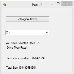
Now in this example we will access Logic drive information such as drive type , drive size and free space of the drive. So first we take four label control to the design window after that handle comboBox1_SelectedIndexChanged event in the program.

Complete code


using System;
using System.Collections.Generic;
using System.ComponentModel;
using System.Data;
using System.Drawing;
using System.IO;
using System.Linq;
using System.Text;
using System.Threading.Tasks;
using System.Windows.Forms;

namespace WindowsFormsApplication2
{
    public partial class Form2 : Form
    {
        public Form2()
        {
            InitializeComponent();
        }

        private void button1_Click(object sender, EventArgs e)
        {
            string[] str = Directory.GetLogicalDrives();
            foreach (string item in str)
            {
                comboBox1.Items.Add(item);

            }

        }

        private void comboBox1_SelectedIndexChanged(object sender, EventArgs e)
        {
            try
            {
                string drive = comboBox1.SelectedItem.ToString();
                label1.Text = "you have Selected Drive " + drive;
                DriveInfo info = new DriveInfo(drive);
                label2.Text = "Drive Type " + info.DriveType.ToString();
                label3.Text = "Free space on drive " + info.AvailableFreeSpace.ToString();
                label4.Text = "Total Size " + info.TotalSize.ToString();


            }
            catch (Exception exp)
            {

                label1.Text = exp.Message;

            }
        }
    }
}


Output
How to Access drive information in c#

How to access system Drives in C#

The Directory class exposes static methods to create , move and enumerate directories and subdirectories.
GetLogicalDrives : Retrieves the name of the logical drives on this computer in the form "<drive letter>:\"

How to access system drives in WebApplication


<%@ Page Language="C#" AutoEventWireup="true" CodeFile="Default9.aspx.cs" Inherits="Default9" %>

<!DOCTYPE html>

<html xmlns="http://www.w3.org/1999/xhtml">
<head runat="server">
    <title></title>
</head>
<body>
    <form id="form1" runat="server">
    <div>
        <asp:Button ID="Button1" runat="server" Text="GetLogical Drives" OnClick="Button1_Click" />
        <br />
        <br />
        <asp:DropDownList ID="DropDownList1" runat="server"></asp:DropDownList>
    </div>
    </form>
</body>
</html>

CodeBehind page

using System;
using System.Collections.Generic;
using System.IO;
using System.Linq;
using System.Web;
using System.Web.UI;
using System.Web.UI.WebControls;

public partial class Default9 : System.Web.UI.Page
{
    protected void Page_Load(object sender, EventArgs e)
    {

    }
    protected void Button1_Click(object sender, EventArgs e)
    {
        string[] str = Directory.GetLogicalDrives();
        foreach (string item in str)
        {
            DropDownList1.Items.Add(item);
        }
    }
}

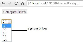
Output of the program is

How to access system Drives in asp.net

How to access system drives in Window Application

form design for How to access system Drives in C#


using System;
using System.Collections.Generic;
using System.ComponentModel;
using System.Data;
using System.Drawing;
using System.IO;
using System.Linq;
using System.Text;
using System.Threading.Tasks;
using System.Windows.Forms;

namespace WindowsFormsApplication2
{
    public partial class Form2 : Form
    {
        public Form2()
        {
            InitializeComponent();
        }

        private void button1_Click(object sender, EventArgs e)
        {
            string[] str = Directory.GetLogicalDrives();
            foreach (string item in str)
            {
                comboBox1.Items.Add(item);

            }

        }
    }
}


Output

How to access system Drives in C#

Display List of Items using ListBox Control: WPF

ListBox control is used to represent a list of items and select a single or some of the items from these. Most often when we have to opt user to select an item from the list of items, then listbox is used.

In WPF this control is somewhat different from the list box of windows forms. It have some properties to be used most often in programming.
  • DataContext: used to specify the source having list of data, through which it will bind. It may be a binding source or an IList.
  • DisplayMemberPath: indicates the name of an object contained in datasource. Specifies what object will be shown to the user.
  • SelectedValue: get or set the selected value from the list of items.
  • SelectedValuePath: used to specify the selected value from the binding source.
  • SelectedIndex: get or set the index of selected value.
  • SelectedItem: indicates the item which is selected.
The following XAML code will create a listbox with three items and none of them is selected.
<ListBox >
<ListBoxItem>first Item</ListBoxItem>
<ListBoxItem>second Item</ListBoxItem>
<ListBoxItem>third Item</ListBoxItem>
</ListBox>

To select an item, set IsSelected property to true. The above XAML code will show a listbox having three items as shown in following image:

ListBox control introduction WPF

The same listbox can also be generated using the following line of code:
<ListBox >
<ListBoxItem>first Item</ListBoxItem>
<ListBoxItem>second Item</ListBoxItem>
<ListBoxItem>third Item</ListBoxItem>
</ListBox>

The listbox can also formatted using its properties like background, foreground and etc. That is how we created a listbox from XAML code.

Thursday, September 5, 2013

Uses of Label Control in WPF

The most usable control in any entry form, details form or any other forms in programming. The textbox is an input control but, on the running mode the label control will notify the user to which value is to be inserted in the relative textbox.


Look out the following entry form in WPF

Entry form showing use of labels: WPF

In the above image the three textboxes are used to input values, but in which order. The respective label will tell us to enter which values in which textbox. The label control which will show a name and some specified width and height is:
<Label>
<Label.Content>Name</Label.Content>
<Label.Height>40</Label.Height>
<Label.Width>100</Label.Width>
</Label>

The above code, when run, will show a text “Name” as in above image. Label control can easily be formatted using its properties like Border Brush, Background, Foreground and etc.

We can easily set an image in label control by using the following line of code:
<Label>
<Label.Background>
<ImageBrush ImageSource="source of image"></ImageBrush>
</Label.Background>
</Label>

That is how we use label control and set image as a background of that label control.

Image Control in WPF

An image can be shown using Microsoft photo viewer, Microsoft Paint or any photo viewing software in windows operating system. But in programming we have to create that from the drawing. If we want to show existing picture then we have to use an in-built control i.e. image control.

Image control is used to display an existing image in WPF programming. The image may be of type bmp, gif, jpg and etc. I have copied an image in my project’s root directory and show that using the below line of code:


<Image Name="imageControl">
<Image.Source>wall.jpg</Image.Source>
</Image>

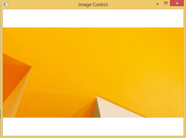
When we run this project it will show a window containing the image like below:

WPF image control without width and height

It will cover all the space provided by default. We can fix this image to the specified location of the fix height and width. The following code will change it of height 200 and width 200.
<Image Name="imageControl" >
<Image.Source>wall.jpg</Image.Source>
<Image.Height>200</Image.Height>
<Image.Width>200</Image.Width>
</Image>

It will show the small image in compare to the above.

WPF image control with height and width

The control have all the common properties except some special e.g.
  • SnapsToDevicePixels: whether this control should use device-pixels settings.
  • Source: get or set the image source for the image.
  • Stretch: how an image should be stretched e.g. fill, none, uniform and etc.
  • StretchDirection: specifies the direction of stretch i.e. up, down or both.
It have much more methods and events as like other controls. The above line of code can also be written in the c# language in code behind file:
Image imageControl = new Image();
imageControl.Source = new BitmapImage(new Uri("wall.jpg",UriKind.Relative));
imageControl.Height = 200;
imageControl.Width = 200;

It will show the same image as in above XAML code with width and height specified.

How to bind FormView control Using SqlDataSource in ASP.NET

The FormView Control

The FormView control displays a single record from the associated data source. Each row of the table displays each field of the record. For the FormView control to display content, you need to create templates for the different parts of the control. You must create a template for the mode in which the control is configured , even trough most of the templates are optional. The FormView control exists within the System.Web.UI.WebControl interface.
To display the content through the FormView control, you need to create templates for different parts of the control. the mode of the control and template should be same. For Example. a FormView control that supports editing records must have an EditItem template.

Bind is the terms for connecting front-end to back-end simply. If you bind FormView control to database you may use SqlDatasource control.
Follow some steps for connecting front-end to back-end
After connected,  you can use Edit template property using the Show Smart tag also select paging CheckBox.
 Edit template property

A new Dialog box open after selected Edit Template . In given template you can select display template.

Display Template
There are many templates in given display template such as Item Template, Footer Template, EditItem Template , InsertItem Template , Header Template , EmptyData Template and Pager Template.
In this example we are using ItemTemplate because Item Template will show on Browser when your page first time load. So we are using horizontal ruler between the field  for formating purpose.

Display Item Template
Now , complete code is
<%@ Page Language="C#" %>

<!DOCTYPE html>

<script runat="server">

</script>

<html xmlns="http://www.w3.org/1999/xhtml">
<head runat="server">
    <title></title>
</head>
<body>
    <form id="form1" runat="server">
    <div>
 
        <asp:FormView ID="FormView1" runat="server" AllowPaging="True" DataKeyNames="Id" DataSourceID="SqlDataSource1" Height="138px" Width="142px">
            <EditItemTemplate>
                Id:
                <asp:Label ID="IdLabel1" runat="server" Text='<%# Eval("Id") %>' />
                <br />
                namet:
                <asp:TextBox ID="nametTextBox" runat="server" Text='<%# Bind("namet") %>' />
                <br />
                Income:
                <asp:TextBox ID="IncomeTextBox" runat="server" Text='<%# Bind("Income") %>' />
                <br />
                <asp:LinkButton ID="UpdateButton" runat="server" CausesValidation="True" CommandName="Update" Text="Update" />
                &nbsp;<asp:LinkButton ID="UpdateCancelButton" runat="server" CausesValidation="False" CommandName="Cancel" Text="Cancel" />
            </EditItemTemplate>
            <InsertItemTemplate>
                namet:
                <asp:TextBox ID="nametTextBox" runat="server" Text='<%# Bind("namet") %>' />
                <br />
                Income:
                <asp:TextBox ID="IncomeTextBox" runat="server" Text='<%# Bind("Income") %>' />
                <br />
                <asp:LinkButton ID="InsertButton" runat="server" CausesValidation="True" CommandName="Insert" Text="Insert" />
                &nbsp;<asp:LinkButton ID="InsertCancelButton" runat="server" CausesValidation="False" CommandName="Cancel" Text="Cancel" />
            </InsertItemTemplate>
            <ItemTemplate>
                Id:&nbsp;&nbsp;&nbsp;&nbsp;&nbsp;&nbsp;
                <asp:Label ID="IdLabel" runat="server" Text='<%# Eval("Id") %>' />
                <br />
                <hr />
                <br />
                namet:
                <asp:Label ID="nametLabel" runat="server" Text='<%# Bind("namet") %>' />
                <br />
                <hr />
                <br />
                Income:
                <asp:Label ID="IncomeLabel" runat="server" Text='<%# Bind("Income") %>' />
                <br />

            </ItemTemplate>
        </asp:FormView>
        <asp:SqlDataSource ID="SqlDataSource1" runat="server" ConnectionString="<%$ ConnectionStrings:ConnectionString %>" SelectCommand="SELECT * FROM [footerex]"></asp:SqlDataSource>
 
    </div>
    </form>
</body>
</html>


Output
How to bind FormView control Using SqlDataSource in ASP.NET


Group Items using Group Box Control: WPF

We are using individual items all the time in our programming, doesn’t matter which programming it is. But sometimes we have to use grouping of items, so that they cannot move on their position with the resizing of the container.

For an example we cannot use two individual radio button controls to show genders on the form. Actually we can, but when we resizing the container, they may move on (from their position) a little bit. That’s why we use a group box control to place them together with a header.

Group box control is used to create a container that has some child controls and a border around them. The following code snippet (in XAML) is used to create a group box having two radio button for male and female.
<GroupBox Header="Gender">
<StackPanel>
<RadioButton Content="Male"/>
<RadioButton Content="FeMale"/>
</StackPanel>
</GroupBox>

Now the question is, why we used stack panel above. The answer is, a group box can contain only one item either it is a single item like label, textbox, radio button or it can be a container like stack panel or grid view. The image shows the output for the above code snippet

Grouping of items using GroupBox control in WPF

Here I used only two items in a group box, you can use as you want through a container. The group box can also be created using code in c# language like:
GroupBox grpBox = new GroupBox();
grpBox.Header = "Gender";

StackPanel stackPanel = new StackPanel();
stackPanel.Children.Add(new RadioButton() { Content = "Male" });
stackPanel.Children.Add(new RadioButton() { Content = "FeMale" });
grpBox.Content = stackPanel;

this.Content = grpBox;

The above code will create the same group box with two radio button in it.
© Copyright 2013 Computer Programming | All Right Reserved