-->

Tuesday, September 3, 2013

How to Add Columns in DataGrid Control: WPF

Datagrid is used to represent a tabular view of data in programming. It have multiple template designs to be customizable by the programmer as per the requirements. It supports some other features like sorting the data, dragging columns and sometimes editing when user needs to do.


To add a DataGrid, just drag-n-drop it from the toolbox. Now it is known as a tabular representation, write following code to add some columns (3 here):
<DataGrid>
<DataGrid.Columns>
<DataGridTextColumn Header="First Column"/>
<DataGridTextColumn Header="Second Column"/>
<DataGridTextColumn Header="Third Column"/>
</DataGrid.Columns>
</DataGrid>

When we run this window then a Datagrid is shown with three columns like in below image:

How to add columns in DataGrid control in WPF

DataGrid provides columns sorting, reordering and sizing with some properties like CanUserReorderColumns, CanUserResizeColumns, CanUserSortColumns and etc. We can even perform grouping of data by adding a group description for the list to be bind.

To add a datagrid using code behind:
DataGrid dataGrid = new DataGrid();

DataGridTextColumn textColumn1 = new DataGridTextColumn();
textColumn1.Header = "First Column";
DataGridTextColumn textColumn2 = new DataGridTextColumn();
textColumn2.Header = "Second Column";
DataGridTextColumn textColumn3 = new DataGridTextColumn();
textColumn3.Header = "Third Column";

dataGrid.Columns.Add(textColumn1);
dataGrid.Columns.Add(textColumn2);
dataGrid.Columns.Add(textColumn3);
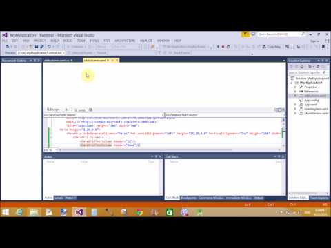
The above code snippet add a same datagrid with three columns as in above image. We will learn binding of datagrid in later articles.

How to bind Chart Control in ASP.NET

A graph or chart diagram represents your set of data.If you want to show your company report then you must use chart control. There are different types of chart show different types of data such as


How to bind Chart Control in ASP.NET
Pie Chart
Using the pie-chart you can classify your data in graphical format. According to above diagram your movie are divided in different sections such as Action take 18% of whole movie as well as 11% take Horror.

Example of How to bind Chart Control using SqlDataSource
Step-1: Create Database Table in visual studio.

Chart Database table

.
Step-2: Bind connection with Database using SqlDataSource
<%@ Register assembly="System.Web.DataVisualization, Version=4.0.0.0, Culture=neutral, PublicKeyToken=31bf3856ad364e35" namespace="System.Web.UI.DataVisualization.Charting" tagprefix="asp" %>

<!DOCTYPE html>

<html xmlns="http://www.w3.org/1999/xhtml">
<head runat="server">
    <title></title>
</head>
<body>
    <form id="form1" runat="server">
    <div>
        <asp:Chart ID="Chart1" runat="server" DataSourceID="SqlDataSource1" OnLoad="Chart1_Load">
            <series>
                <asp:Series ChartType="Pie" Name="Series1" XValueMember="movie_type" YValueMembers="percentage">
                </asp:Series>
            </series>
            <chartareas>
                <asp:ChartArea Name="ChartArea1">
                    <Area3DStyle Enable3D="True" />
                </asp:ChartArea>
            </chartareas>
        </asp:Chart>
        <asp:SqlDataSource ID="SqlDataSource1" runat="server" ConnectionString="<%$ ConnectionStrings:ConnectionString %>" SelectCommand="SELECT * FROM [movie]"></asp:SqlDataSource>
    </div>
    </form>
</body>
</html>

Output
How to bind Chart Control in ASP.NET

Monday, September 2, 2013

How to Use ComboBox Control in WPF

Dropdown list provides user to select an item from the existing list of items. Combo Box is a control allowing the user to either to type a value into the control or choose from a list. It means it is a combination of textbox and a drop down list.

Combo Box can contain a collection of objects of any type, it means it is an Items Control. To add some items in combo Box through XAML:
<ComboBox Name="cmbBox">
<ComboBox.Items>
<sys:String>First Item</sys:String>
<sys:String>Second Item</sys:String>
<sys:String>Third Item</sys:String>
</ComboBox.Items>
</ComboBox>


The above code snippet is used to simply add string type data to combo box. By using the above code snippet a combo box with three items will be created like in following image:

ComboBox control in WPF

The same combo box can also be added dynamically using the following code snippet of c# language.
ComboBox cmbBox = new ComboBox();
cmbBox.Name = "cmbBox";
cmbBox.Items.Add("First Item");
cmbBox.Items.Add("Second Item");
cmbBox.Items.Add("Third Item");

Now add this combo box to the container to which you want. The same combo box as in above image will be generated using this code snippet. We can perform any other operation on the click event of selection changed event of combo box. Generate the selectionChanged event and write it as the following code snippet.
private void cmbBox_SelectionChanged(object sender, SelectionChangedEventArgs e)
{
MessageBox.Show("ComboBox Selection Changed");
}

Whenever you change the selected item of this combo box, it will show a message as written in above code.

How to use Calendar Control in ASP.NET

The Calendar Control

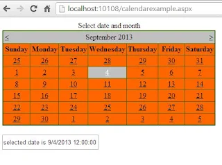
The Calendar control display a graphic calendar on which users can select dates. This control exists within System.Web.UI.WebControls namespace. You can use the Calendar control to display a single month of a calendar on a Web page . This control allows you to select dates and move to the next or previous month. By Setting the SelectionMode property , You can select a single day , week, or month.
By Default , the control displays the days of the month , day headings for the of the week , a title with the name of the month , and arrow characters for navigating to the next and previous months. You can customize the appearance of calendar control by setting the properties that control the style for different parts of the control.

Example of Calendar Control

<%@ Page Language="C#" %>

<!DOCTYPE html>

<script runat="server">


    protected void Calendar1_SelectionChanged(object sender, EventArgs e)
    {
        TextBox1.Text = "selected date is " + Calendar1.SelectedDate;
    }

    protected void Page_Load(object sender, EventArgs e)
    {
        Calendar1.SelectedDate = DateTime.Now;
     
    }
</script>

<html xmlns="http://www.w3.org/1999/xhtml">
<head runat="server">
    <title></title>
</head>
<body>
    <form id="form1" runat="server">
    <div>
        <asp:Calendar ID="Calendar1" runat="server" BackColor="#FF6600" BorderColor="#336600" BorderStyle="Solid" BorderWidth="2px" Caption="Select date and month" DayNameFormat="Full" OnSelectionChanged="Calendar1_SelectionChanged" ShowGridLines="True" Width="459px"></asp:Calendar>
        <br />
        <asp:TextBox ID="TextBox1" runat="server" Height="26px" Width="203px"></asp:TextBox>
        <br />
    </div>
    </form>
</body>
</html>


Output
How to use Calendar Control in ASP.NET
Here some initialized properties are:
Caption : Obtains or sets a text value that is rendered as a caption for the calendar control.
ShowGridLines : Obtains or sets a value indicating whether the heading for the days of the week is displayed.
DayNameFormat : Obtains or sets the name format for the days of the week .

Dynamically Enable or Disable ASP.NET Controls

If your controls are enable then you take some action onto the controls such as checked or unchecked CheckBox and If they are disable then you don't take some action onto the controls.
In previous example we saw checked property of checkbox control .

Example of Dynamically Enable or Disable ASP.NET Controls


<%@ Page Language="C#" %>

<!DOCTYPE html>

<script runat="server">

    protected void Button2_Click(object sender, EventArgs e)
    {
        Button1.Enabled = true;
        CheckBox1.Enabled = true;
        RadioButton1.Enabled = true;
        TextBox1.Enabled = true;


    }

    protected void Button3_Click(object sender, EventArgs e)
    {
        Button1.Enabled = false;
        CheckBox1.Enabled = false;
        RadioButton1.Enabled = false;
        TextBox1.Enabled = false;

    }
</script>

<html xmlns="http://www.w3.org/1999/xhtml">
<head runat="server">
    <title></title>
</head>
<body>
    <form id="form1" runat="server">
    <div>
        <asp:Button ID="Button1" runat="server" Text="Button Control" />

        <br />
        <br />
        <asp:CheckBox ID="CheckBox1" runat="server" Text="CheckBox Controls" />
        <br />
        <br />
        <asp:TextBox ID="TextBox1" runat="server" Width="164px">TextBox Control</asp:TextBox>
        <br />
        <br />
        <asp:RadioButton ID="RadioButton1" runat="server" Text="Radio Button Control" />
        <br />
        <br />
        <br />
        <asp:Button ID="Button2" runat="server" OnClick="Button2_Click" Text="Controls Enable" />
&nbsp;
        <asp:Button ID="Button3" runat="server" Text="Controls Disable" OnClick="Button3_Click" />

    </div>
    </form>
</body>
</html>

Output
Dynamically disable controls Dynamically Enable controls


How to use Checked property of CheckBox Control

Checked property is shows that your checkbox is either checked or not .Take a one example for showing image when your checkbox is checked. algorithm of the example are:
-->Drop one CheckBox control to Webpage
-->Set AutoPostBack property is true. Because when your CheckBox is checked then your page request send to the server . After server response your business logic event handler should executed.

Example of Showing Image when your CheckBox is checked.


<%@ Page Language="C#" %>

<!DOCTYPE html>

<script runat="server">

    protected void Page_Load(object sender, EventArgs e)
    {

    }

    protected void CheckBox1_CheckedChanged(object sender, EventArgs e)
    {
        if (CheckBox1.Checked)
        {
            Image1.Visible = true;
        }
        else
        {
            Image1.Visible = false;
        }
     
     
    }
</script>

<html xmlns="http://www.w3.org/1999/xhtml">
<head runat="server">
    <title>Checked Property</title>
</head>
<body>
    <form id="form1" runat="server">
    <div>
        <asp:CheckBox ID="CheckBox1" runat="server" AutoPostBack="True" Text="Show Image" OnCheckedChanged="CheckBox1_CheckedChanged" />
        <br />
        <asp:Image ID="Image1" runat="server" Height="161px" ImageUrl="~/download.jpg" Visible="False" Width="175px" />
    </div>
    </form>
</body>
</html>

Output
How to use Checked property of CheckBox Control

Sunday, September 1, 2013

How to get Multiple selected listbox item in ASP.NET


<%@ Page Language="C#" %>

<!DOCTYPE html>

<script runat="server">

    protected void ListBox1_SelectedIndexChanged(object sender, EventArgs e)
    {
        foreach (ListItem li in ListBox1.Items)
        {
            if (li .Selected )
            {
                result.Text += li.Text + "<br/>";
                 
            }
        }
    }
</script>

<html xmlns="http://www.w3.org/1999/xhtml">
<head runat="server">
    <title></title>
</head>
<body>
    <form id="form1" runat="server">
    <div>
        <asp:ListBox SelectionMode ="Multiple" ID="ListBox1" runat="server" AutoPostBack="True" OnSelectedIndexChanged="ListBox1_SelectedIndexChanged">
            <asp:ListItem>Your first item</asp:ListItem>
            <asp:ListItem>Your Second Item</asp:ListItem>
            <asp:ListItem>Your Third item</asp:ListItem>
        </asp:ListBox>
        <br />
        <br />
        <asp:Label ID="result" runat="server" Text=""></asp:Label>
    </div>
    </form>
</body>
</html>

Output
How to get Multiple selected listbox item in ASP.NET

© Copyright 2013 Computer Programming | All Right Reserved