-->

Tuesday, September 3, 2013

Bind ComboBox Control With Grid Resource: WPF

In my previous post, I have wrote about the combo box control and add some string items. In this article I will add a grid source and then bind that source to combo box control with some easy steps.

By default a grid is placed in the XAML code file of a window. Just add the below code in the grid snippet:
<Grid.Resources>          
<x:ArrayExtension Type="{ x:Type sys:String}" x:Key="cmbPlacesSource">
<sys:String>London</sys:String>
<sys:String>Italy</sys:String>
<sys:String>California</sys:String>
<sys:String>France</sys:String>
</x:ArrayExtension>
</Grid.Resources>

The above code is defining an array extension which will be used as a source of the combo box. Now add a combo box and it should be look like the following code:
<ComboBox Name="cmbPlaces" Height="30" Width="100"
 Text="Select Places-"
 IsEditable="True"
 ItemsSource="{StaticResource cmbPlacesSource}">
</ComboBox>
Here in the above code, it doesn’t matter of height and width, you can provide these as you want. The must thing is ItemsSource of the combobox. As you are looking the code it is the same name of the above array extension. It will show all the data defined in the above source i.e. as in following image:

ComboBox binding with Grid Resource in WPF

In above image by default "Select Places-" is shown, which can be set by the text property with IsEditable property to true. In the selection changed event of combo box, we can get the selected value by using the following code:
private void cmbBox_SelectionChanged(object sender, SelectionChangedEventArgs e)
{
string selectedValue = cmbPlaces.Text;
MessageBox.Show(selectedValue);
}

Each time when the selection index will change, it will show a message box with the selected text. So we can easily get the selected text of the combo box.

DatePicker Control in WPF

In my previous post, we have learnt about calendar control which is used to select a date through a mouse click. The DatePicker control allows the user to either typing the date or selecting it through a mouse movement. By default it shows a textbox written "Select a date" into it, and we will expand a calendar control by clicking on the right side of the control.

By using a single line i.e. <DatePicker /> a date picker control is added to the WPF window as shown in following image:


DatePicker Control in WPF

All the common properties are customizable by the programmer. Some mostly usable properties are:

  • DisplayDate: used to get or set the display date. By default it is today.
  • IsDropDownOpen: used to enable or disable the calendar control to be expand.
  • DisplayDateStart: set the first date from the control will show the dates.
  • DisplayDateEnd: set the last date till the control will show the dates.
  • FirstDayOfWeek: By default it is “Monday” and can be changed by this property.
  • SelectedDate: used to get of set the selected date. By default it is today. If it is not today then we can set it using <DatePicker SelectedDate="{x:Static sys:DateTime.Now}"/>.
  • Blackout Dates: the same procedure can be used as in calendar control.

All these properties are used in the same way in calendar control. If one want to add a DatePicker dynamically then use the following code:
DatePicker datePicker = new DatePicker();
datePicker.Name = "datePicker";
datePicker.Width = 200;
datePicker.DisplayDateStart = new DateTime(2013, 9, 1);
datePicker.DisplayDateEnd = new DateTime(2013, 9, 30);
datePicker.FirstDayOfWeek = DayOfWeek.Sunday;
datePicker.IsTodayHighlighted = true;

Now at the last add this datePicker to the desired container where you want to place.

How to Create WebPartManager Control in code

The WebPartManager Control

The WebPartManager control acts like a centralized hub that manages all the other Web Parts controls on a Web page. This control coordinates the interaction between Web Parts and Web Parts zone. The WebPartManager control manages the personalization states of Web Parts controls on a Web page. Personalization allows storing of User information and all the runtime customization (defined by the user) in a persistent storage (typically SQLServer database). These customizations are loaded when the user visits the website the next time. If you create a Web page that uses Web Parts controls, ensure that the page contains a WebPartManager control . There must be only one intance of the WebPartManager control on each Web page that uses the control, and it must be placed before other Web Parts Zone controls are placed on the Web page. The WebPartManager control is an object of the WebPartManager class.

The WebPartManager control performs the following tasks to control the functionality of a Web page.


  • Keeping track of different controls on a Web page.
  • Inserting and removing controls on a Web page 
  • Establishing , monitoring and managing connections between various Web Parts controls.
  • Enabling you to customize the appearance of a Web page by dragging various controls to different locations on the page.
  • Providing various views , Which you can use to change and personalize the properties and behavior of controls.
  • Enabling you to toggle between different views of a Web Page , Thereby simplifying certain tasks, such as modifying layout and editing controls.

Using the WebPartManager Class

The WebPartManager class allows users to toggle between various display modes . These display modes help the user to perform different actions on the Web page, such as changing the layout of a Web page or editing controls, and the rest. The WebPartManager class has the following five display modes:
BrowseDisplayMode- Specifies the default display mode for pages that contain Web Parts controls.
CatalogDisplayMode-Specifies the display mode in which a catalog of controls is visible . A user can add controls to a Web page from the catalog.
ConnectDisplayMode- Represents the display mode in which the connection UI is visible and where users can manage the connections between the controls of Web page.
DesignDisplayMode- Represents the display mode in which the user can modify the layout of a Web page.
EditDisplayMode- Specifies the display mode in which the user can change the appearance , properties and behavior of server controls.


<%@ Page Language="C#" AutoEventWireup="true" CodeFile="Createwebpart.aspx.cs" Inherits="Createwebpart" %>

<!DOCTYPE html>

<html xmlns="http://www.w3.org/1999/xhtml">
<head runat="server">
    <title></title>
</head>
<body>
    <form id="form1" runat="server">
    <div>
        <asp:Button ID="Button1" runat="server" Text="Create web part" OnClick="Button1_Click" />

        <br />
        <asp:Label ID="Label1" runat="server"></asp:Label>

    </div>
    </form>
</body>
</html>

Output
How to Create WebPartManager Control in code

How to Add Columns in DataGrid Control: WPF

Datagrid is used to represent a tabular view of data in programming. It have multiple template designs to be customizable by the programmer as per the requirements. It supports some other features like sorting the data, dragging columns and sometimes editing when user needs to do.


To add a DataGrid, just drag-n-drop it from the toolbox. Now it is known as a tabular representation, write following code to add some columns (3 here):
<DataGrid>
<DataGrid.Columns>
<DataGridTextColumn Header="First Column"/>
<DataGridTextColumn Header="Second Column"/>
<DataGridTextColumn Header="Third Column"/>
</DataGrid.Columns>
</DataGrid>

When we run this window then a Datagrid is shown with three columns like in below image:

How to add columns in DataGrid control in WPF

DataGrid provides columns sorting, reordering and sizing with some properties like CanUserReorderColumns, CanUserResizeColumns, CanUserSortColumns and etc. We can even perform grouping of data by adding a group description for the list to be bind.

To add a datagrid using code behind:
DataGrid dataGrid = new DataGrid();

DataGridTextColumn textColumn1 = new DataGridTextColumn();
textColumn1.Header = "First Column";
DataGridTextColumn textColumn2 = new DataGridTextColumn();
textColumn2.Header = "Second Column";
DataGridTextColumn textColumn3 = new DataGridTextColumn();
textColumn3.Header = "Third Column";

dataGrid.Columns.Add(textColumn1);
dataGrid.Columns.Add(textColumn2);
dataGrid.Columns.Add(textColumn3);

The above code snippet add a same datagrid with three columns as in above image. We will learn binding of datagrid in later articles.

How to bind Chart Control in ASP.NET

A graph or chart diagram represents your set of data.If you want to show your company report then you must use chart control. There are different types of chart show different types of data such as


How to bind Chart Control in ASP.NET
Pie Chart
Using the pie-chart you can classify your data in graphical format. According to above diagram your movie are divided in different sections such as Action take 18% of whole movie as well as 11% take Horror.

Example of How to bind Chart Control using SqlDataSource
Step-1: Create Database Table in visual studio.

Chart Database table

.
Step-2: Bind connection with Database using SqlDataSource
<%@ Register assembly="System.Web.DataVisualization, Version=4.0.0.0, Culture=neutral, PublicKeyToken=31bf3856ad364e35" namespace="System.Web.UI.DataVisualization.Charting" tagprefix="asp" %>

<!DOCTYPE html>

<html xmlns="http://www.w3.org/1999/xhtml">
<head runat="server">
    <title></title>
</head>
<body>
    <form id="form1" runat="server">
    <div>
        <asp:Chart ID="Chart1" runat="server" DataSourceID="SqlDataSource1" OnLoad="Chart1_Load">
            <series>
                <asp:Series ChartType="Pie" Name="Series1" XValueMember="movie_type" YValueMembers="percentage">
                </asp:Series>
            </series>
            <chartareas>
                <asp:ChartArea Name="ChartArea1">
                    <Area3DStyle Enable3D="True" />
                </asp:ChartArea>
            </chartareas>
        </asp:Chart>
        <asp:SqlDataSource ID="SqlDataSource1" runat="server" ConnectionString="<%$ ConnectionStrings:ConnectionString %>" SelectCommand="SELECT * FROM [movie]"></asp:SqlDataSource>
    </div>
    </form>
</body>
</html>

Output
How to bind Chart Control in ASP.NET

Monday, September 2, 2013

How to Use ComboBox Control in WPF

Dropdown list provides user to select an item from the existing list of items. Combo Box is a control allowing the user to either to type a value into the control or choose from a list. It means it is a combination of textbox and a drop down list.

Combo Box can contain a collection of objects of any type, it means it is an Items Control. To add some items in combo Box through XAML:
<ComboBox Name="cmbBox">
<ComboBox.Items>
<sys:String>First Item</sys:String>
<sys:String>Second Item</sys:String>
<sys:String>Third Item</sys:String>
</ComboBox.Items>
</ComboBox>


The above code snippet is used to simply add string type data to combo box. By using the above code snippet a combo box with three items will be created like in following image:

ComboBox control in WPF

The same combo box can also be added dynamically using the following code snippet of c# language.
ComboBox cmbBox = new ComboBox();
cmbBox.Name = "cmbBox";
cmbBox.Items.Add("First Item");
cmbBox.Items.Add("Second Item");
cmbBox.Items.Add("Third Item");

Now add this combo box to the container to which you want. The same combo box as in above image will be generated using this code snippet. We can perform any other operation on the click event of selection changed event of combo box. Generate the selectionChanged event and write it as the following code snippet.
private void cmbBox_SelectionChanged(object sender, SelectionChangedEventArgs e)
{
MessageBox.Show("ComboBox Selection Changed");
}

Whenever you change the selected item of this combo box, it will show a message as written in above code.

How to use Calendar Control in ASP.NET

The Calendar Control

The Calendar control display a graphic calendar on which users can select dates. This control exists within System.Web.UI.WebControls namespace. You can use the Calendar control to display a single month of a calendar on a Web page . This control allows you to select dates and move to the next or previous month. By Setting the SelectionMode property , You can select a single day , week, or month.
By Default , the control displays the days of the month , day headings for the of the week , a title with the name of the month , and arrow characters for navigating to the next and previous months. You can customize the appearance of calendar control by setting the properties that control the style for different parts of the control.

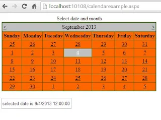
Example of Calendar Control

<%@ Page Language="C#" %>

<!DOCTYPE html>

<script runat="server">


    protected void Calendar1_SelectionChanged(object sender, EventArgs e)
    {
        TextBox1.Text = "selected date is " + Calendar1.SelectedDate;
    }

    protected void Page_Load(object sender, EventArgs e)
    {
        Calendar1.SelectedDate = DateTime.Now;
     
    }
</script>

<html xmlns="http://www.w3.org/1999/xhtml">
<head runat="server">
    <title></title>
</head>
<body>
    <form id="form1" runat="server">
    <div>
        <asp:Calendar ID="Calendar1" runat="server" BackColor="#FF6600" BorderColor="#336600" BorderStyle="Solid" BorderWidth="2px" Caption="Select date and month" DayNameFormat="Full" OnSelectionChanged="Calendar1_SelectionChanged" ShowGridLines="True" Width="459px"></asp:Calendar>
        <br />
        <asp:TextBox ID="TextBox1" runat="server" Height="26px" Width="203px"></asp:TextBox>
        <br />
    </div>
    </form>
</body>
</html>


Output
How to use Calendar Control in ASP.NET
Here some initialized properties are:
Caption : Obtains or sets a text value that is rendered as a caption for the calendar control.
ShowGridLines : Obtains or sets a value indicating whether the heading for the days of the week is displayed.
DayNameFormat : Obtains or sets the name format for the days of the week .
© Copyright 2013 Computer Programming | All Right Reserved