-->

Wednesday, September 11, 2013

How to access anchor tag in code file in ASP.NET

The HtmlAnchor Class

The HtmlAnchor class is used to create an anchor, <a>, element for navigation. This class can be used for the following purpose:
Navigation- You can use the Href property and provide the address of anchor website, where you want to take the user . Alternatively , you can also take the user at a different location of the same page.
Handling events : You can handle the events of this class , such as the ServerClick event, to programmatically perform the desired actions, when user interacts with the anchor <a> element.
This HtmlAnchor class gives you access to the HTML <a> tag in server code.

Event of the HtmlAnchor Class

ServerClick : Occurs when the user clicks an Anchor control in the browser, This event is handled in the server.

Example of How to access anchor tag in code file in ASP.NET


<%@ Page Language="C#" %>

<!DOCTYPE html>

<script runat="server">

    protected void anchor1_ServerClick(object sender, EventArgs e)
    {
        anci.InnerHtml = " welcome to anchor tag";
    }
</script>

<html xmlns="http://www.w3.org/1999/xhtml">
<head runat="server">
    <title></title>
</head>
<body>
    <form id="form1" runat="server">
    <div>
    <a id="anchor1" runat ="server" onserverclick ="anchor1_ServerClick">Click here</a>
        <br />
        <span id="anci" runat ="server" ></span>
    </div>
    </form>
</body>
</html>
Output
How to access anchor tag in code file in ASP.NET

How to access html form element in code file in ASP.NET

The HtmlForm Class

The HtmlForm class can be used to access the HTML <form> element in the code file. If you add any HTML control to the form using ASP.NET IDE , the web form automatically converts that control into the object of the HtmlForm class. You can also create additional forms using the HtmlForm class, if required. All server controls that postback to the server must be placed between the opening and closing tags of an HTML form. You can use the HTML Form class to get access to the HTML <form> element on the server.
This class inherits the HtmlControl class.

Lets take an example

The Html Form class can be used to access the HTML <form> elements in the code file
<%@ Page Language="C#" %>

<!DOCTYPE html>

<script runat="server">
    protected void Submit1_ServerClick(Object Sender, EventArgs e)
    {
        ename.InnerHtml = Text1.Value.ToString();
        fsub.InnerHtml = Text2.Value.ToString();
     
    }

</script>

<html xmlns="http://www.w3.org/1999/xhtml">
<head runat="server">
    <title></title>
</head>
<body>
    <form id="form1" runat="server">
    <div>
Enter Your name: <input id="Text1" type="text" runat ="server" /><br />
   Enter your fav. Subject: <input id="Text2" type="text" runat ="server" /><br />
        <input id="Submit1" type="submit" value="submit" runat ="server" onserverclick ="Submit1_ServerClick" />
        <br />
        Your enter name: <span id="ename" runat="server" /> <br />
        Your Fav. subject <span id="fsub" runat ="server" />

    </div>
    </form>
</body>
</html>


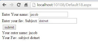
Output
How to access html form element in code file in ASP.NET

Tuesday, September 10, 2013

Specify Range with ProgressBar Control: WPF

Progress bar is also a range control as the slider control in our previous post. It has a different visibility to user. In windows operating system, when we copying/moving/large-running operations, then by default a progress bar is shown. This progress bar notify the status of progress, to the user.

How to use Progress bar control in WPF

To show the above progress bar below XAML code have been used:
<ProgressBar Minimum="0" Maximum="100" Value="25" Height="30" Width="300" Margin="10">
</ProgressBar>
This control also have its common properties like minimum, maximum and value as in slider control. By default minimum is zero, maximum is ten and value is zero. It have two mostly used and new properties:
  • IsIndeterminent: it is used to show the animation in progress bar control. It doesn’t need minimum, maximum and value properties. Mostly used when we don’t let the user know about the progress.
  • Orientation: It can be set to vertical, and the progress bar show the progress in vertical form as shown in the following image.
Use Progress bar control with vertical orientation: WPF

How to Specify Range with Slider Control: WPF

Range controls are used to get or set numeric values that falls within a specified range. These controls are inherited from an abstract class RangeBase, which provides basic features. Some common properties of these controls, mostly used are:
  • Minimum: get or set the minimum value of the control. By default it is zero.
  • Maximum: get or set the maximum value of the control. By default it is Ten.
  • Value: get or set the current value of the control. By default it is zero.
By using the following lines of XAML code, a slider control will place on the window:


<Slider Name="slider" Minimum="0" Maximum="100" Value="25" Height="25" Width="300">
</Slider>

Run the code and the slider control is on your screen, with value 25- defined above.

Slider control WPF

Ticks can be used to place the slider on exact position. We can enable ticks by using the property TickPlacement. It have four values i.e. None, Both, TopLeft and BottomRight.
  • None: it will give a simple look as in above image. 
  • TopLeft: the ticks will placed on left with vertical orientation and top with horizontal. 
  • BottomRight: the ticks will placed on right with vertical orientation and bottom with horizontal.
  • Both: It is used on both left and right, when the orientation is vertical.
The following image shows the slider control with TickPlacement set to TopLeft.

Slider control with TickPlacement in WPF

How to Customize Items in ComboBox: WPF

In our previous post I have discussed about the introduction of combo box control and insert some items in it. What if I want to insert an image also with a text in combo box items? So in this article, I will add some items in combo box which will have text as well as an image also.

To place an image and a text, I am using a stack panel with orientation horizontal. This stack panel will contain an image and a textblock, providing sufficient information. Check out the below code:
<ComboBox Name="customizeComboBox" Height="30" Width="200"
 IsEditable="True">
<StackPanel TextSearch.Text="Item 1" Orientation="Horizontal">
<Image Source="image1.png"></Image>
<TextBlock Text="First item with image"></TextBlock>
</StackPanel>
<StackPanel TextSearch.Text="Item 2" Orientation="Horizontal">
<Image Source="image2.png"></Image>
<TextBlock Text="Second item with image"></TextBlock>
</StackPanel>
</ComboBox>

The XAML code have simple definition of combo box which contains a name, height and width. IsEditable property will be used to do some search when user will type something in combo box. In the combo box tags I have used two stack panel (may be more), with an image and a text.

Run the code and a combobox will be shown with two items, each containing an image and a text specified above:

Customize items in combo box wpf

How to bind DropDownList using XmlDataSource in ASP.NET

The XmlDataSource Control

The XmlDataSource control allows a data bound control to bind the data from a XML document. This control also supports XPath expressions that allows to return only certain nodes from the XML document.

Public Properties of XmlDataSource class

DataFile : Specifies the file name of an XML file that the data source binds to.

Advantage of XML File  

  • Its a Text file.
  • Use for carry data.
  • Build hierarchy of user defined tags. 
  • Best use in transformation.

The DropDownList Control

The DropDownList control displays the list of data as a drop-down list from which you can make a single selection. The DropDownList control exists within the System.Web.UI.WebControls namespace. You cannot select multiple items in this control because when you make a selection from the list, the list closes automatically.
The DropDownList control has no non-inherited methods or events. This class inherited the ListControl class.

Public Properties of DropDownList Class

SelectedIndex : Obtains or sets the index of the selected item in the control.

Application of DropDownList Control

  • In Registration page where you can select your country in given DropDownList.
  • In management project where you can select single option in given options.
Source : dreamhost.com

Lets take simple example

<%@ Page Language="C#" %>

<!DOCTYPE html>

<script runat="server">

    protected void DropDownList1_SelectedIndexChanged(object sender, EventArgs e)
    {
        Label1.Text = "Your Selected Url is <br/>" + DropDownList1.SelectedValue;
    }
</script>

<html xmlns="http://www.w3.org/1999/xhtml">
<head runat="server">
    <title></title>
</head>
<body>
    <form id="form1" runat="server">
    <div>
 
        <asp:DropDownList ID="DropDownList1" runat="server" AutoPostBack="True" DataSourceID="XmlDataSource1" DataTextField="Text" DataValueField="url" OnSelectedIndexChanged="DropDownList1_SelectedIndexChanged">
        </asp:DropDownList>
        <asp:XmlDataSource ID="XmlDataSource1" runat="server" DataFile="~/XMLFile.xml"></asp:XmlDataSource>
 
    </div>
        <asp:Label ID="Label1" runat="server"></asp:Label>
    </form>
</body>
</html>

Output
How to bind DropdownList using XmlDataSource in ASP.NET

How to use RadioButtonList Control in ASP.NET

The RadioButtonList Control

The RadioButtonList control displays data as a column of radio buttons and provides you with an easy way to display a single selection in the radio button group. The RadioButtonList control exists within the System.Web.UI.WebControls namespace. One useful aspect of this control is that the list of radio buttons can be generated at runtime through data binding. To determine the item that is selected in a RadioButton control, you can test the SelectedItem property of the list. You can also determine the index of the selected item with the SelectedIndex property .
 This class is also inherited from the ListControl class.

Public Properties of the RadioButtonList class

TextAlign : Obtains or sets the text alignment for the radio button caption.

Application of the RadioButtonList Control

  • In Examination paper design
Examination paper design
Source : infosolutionsgoa.com 

Lets take an example 


<%@ Page Language="C#" %>

<!DOCTYPE html>

<script runat="server">

    protected void RadioButtonList1_SelectedIndexChanged(object sender, EventArgs e)
    {
        Label1.Text = "Your selected item is <br/>"+RadioButtonList1.SelectedItem.Text;
     
    }
</script>

<html xmlns="http://www.w3.org/1999/xhtml">
<head runat="server">
    <title></title>
</head>
<body>
    <form id="form1" runat="server">
    <div>
 
        <asp:RadioButtonList ID="RadioButtonList1" runat="server" AutoPostBack="True" DataSourceID="SqlDataSource1" DataTextField="namet" DataValueField="Id" OnSelectedIndexChanged="RadioButtonList1_SelectedIndexChanged">
        </asp:RadioButtonList>
        <br />
        <asp:Label ID="Label1" runat="server"></asp:Label>
        <asp:SqlDataSource ID="SqlDataSource1" runat="server" ConnectionString="<%$ ConnectionStrings:ConnectionString %>" SelectCommand="SELECT * FROM [footerex]"></asp:SqlDataSource>
 
    </div>
    </form>
</body>
</html>


Output
How to use RadioButtonList Control in ASP.NET

© Copyright 2013 Computer Programming | All Right Reserved