-->

Saturday, November 23, 2013

Unformatted Input/Output Functions with Example: C Language

In our earlier post i have discussed about sequential and compound statements. Now in this post we will discuss about unformatted i/o functions. There are several standard library functions available in this category - those that can deal with a single character and those that can deal with a string of characters. The various unformatted input/output functions in C are shown below:

Unformatted Input/Output Functions with Example: C Language

getchar( ) and putchar( )

Even though getchar( ) and putchar( ) looks like functions, they are not. They are the macros that are used to read and display a character. The syntax to read a character shown below:

“ch = getchar( )” will reads a character from the keyboard and copy it into memory area which is identified by the variable ch. No arguments are required for this macro. Once the character is entered from the keyboard, the user has to press Enter key.

“putchar(ch)” outputs a character stored in a variable on the monitor. The variable should be passed as parameter as shown in the above syntax.

Example1
main()
{
 char ch;
 clrscr();
 ch = getchar();
 putchar(ch);
 getch();
}

getch(), getche() and putch()

The functions getch() and getche() are used to read a character from the keyboard, similar to getchar(). Both functions don’t need a return key pressed to terminate the reading of a character. A character entered will itself terminates reading. 

In case of getch(), the character entered is not displayed or echoed on the screen, whereas in getche(), the character entered is echoed or displayed on the screen. Syntax for both the macros
ch = getch();            /*Typed character will not be displayed on the screen*/
ch = getche();            /*Typed character will be displayed on the screen*/

Now, we have to display the inputted character on the screen, putch() macro is introduced.
“putch(ch)” This function outputs a character stored in the memory, on the monitor. The variable should be passed as parameter to the functions. In the above syntax ‘ch’ is used as an argument and its value is displayed on the screen.
Example2:
main()
{
  char ch;
  clrscr();
  ch = getche();
  putch(ch);
  getch();
}

gets() and puts()

These functions are used to read a set of characters (string) from the keyboard and display a set of characters (string) on the screen.
char str[5];
gets(str);
        /* Reads a set of characters into memory area str */
puts(str);         /* Displays a set of characters from memory area str */
Example3
main()
{
  char str[10];
  clrscr();
  gets(str);
  puts(str);
  getch();
}

Formatted I/O Functions

Thursday, November 21, 2013

Windows Store App : How to use Grid in XAML

Introduction

By-default a Grid element has one row and one column i.e. a single cell, any control placed inside the Grid will be placed in this cell. Lets see the below simple XAML code where a textbox is placed in the first row and first column. Programmer is not specifying here, but it have value of Grid.Row as well as Grid.Column property to zero.

<Grid Background="{StaticResource ApplicationPageBackgroundThemeBrush}">
        <TextBlock Text="Hello World" />
</Grid>

How to Insert multiple Rows and Columns in Grid

Step-1 : Create <Grid.RowDefinitions> and <Grid.ColumnDefinitions > inside the Grid.

  <Grid Background="{StaticResource ApplicationPageBackgroundThemeBrush}">
        <Grid.RowDefinitions>              
        </Grid.RowDefinitions>

        <Grid.ColumnDefinitions >             
        </Grid.ColumnDefinitions>

</Grid>
Step-2: Lets create Three rows and three columns, by adding three RowDefinition and ColumnDefinition child as in below code.

<Grid Background="{StaticResource ApplicationPageBackgroundThemeBrush}">
        <Grid.RowDefinitions>   
            <RowDefinition Height="150"/>
            <RowDefinition Height="Auto" />
            <RowDefinition Height="*" />
           
        </Grid.RowDefinitions>
        <Grid.ColumnDefinitions >          
            <ColumnDefinition Width="*" />
            <ColumnDefinition Width="*" />
            <ColumnDefinition Width="*" />
        </Grid.ColumnDefinitions>

</Grid>

Here we have three rows and three column. Every row contains height attribute and column contains width attribute.The first row's height, expressed as an integer value for a pixel count. In the second row's height, described by a literal "Auto" or you can say height will adjust according to the content which will placed inside the grid. In third row's height, described by the asterisk character(*)  means you can say the last row will take remaining space of the grid.

How to place controls in rows and columns 

Generally grid is used when we are placing elements in no. of rows and columns. Suppose we want to move control to the second row and second column. To do that we have to set the value of Grid.Row and Grid.Column attribute of the respective element. Review the following XAML:

<Grid Background="{StaticResource ApplicationPageBackgroundThemeBrush}">
        <Grid.RowDefinitions>   
            <RowDefinition Height="150"/>
            <RowDefinition Height="Auto" />
            <RowDefinition Height="*" />
           
        </Grid.RowDefinitions>
        <Grid.ColumnDefinitions >          
            <ColumnDefinition Width="*" />
            <ColumnDefinition Width="*" />
            <ColumnDefinition Width="*" />
        </Grid.ColumnDefinitions>
        <TextBlock x:Name="firstBlock" Text=" Hello World" Grid.Row="1" Grid.Column="1" />
    </Grid>

Look out the above code, i have set the value of Grid.Row and Grid.Column to 1 for textbox element. By this it will placed in the second row and second column.

Design view of the code

Grid row definition and column definition in xaml: Windows Store App

Here your snap simplifies relation between TextBlock and Grid. Lets take a simple theory to understand how to define TextBlock outside the Grid.RowDefinitions and Grid.ColumnDefinitions.

Suppose you have three fruits apple, grapes and orange now you want to place all of them in individual row and column. Then you can simply place these items in the specified rows and column using Grid.Row and Grid.Column attribute.

Wednesday, November 20, 2013

How to Implement Custom Control, Currency TextBox: Windows Forms

Currency Textbox, custom control, as the name implies, will accept only numbers, decimals and control characters. None of other type will be allowed in this textbox. This textbox is basically used to input prices, rates or any measurement including precision.

I have discussed about all the events used to create custom textbox. Open your Visual Studio 2013 Windows Forms project and add a new class named “CurrencyTextBox”, inherit this by System.Windows.Forms.TextBox. Go through the following points, they all together will make this textbox:

Property

Property will be used to get or set the value in the textbox.
private decimal currencyValue;
public decimal CurrencyValue
        {
            get { return currencyValue; }
            set { currencyValue = value; }
        }

Constructor

When the object of this class has been created, by-default it’s value is set to zero, as written in the below c# code.
public CurrencyTextBox()
        {
            currencyValue = 0;
        }

OnKeyPress

What is to be allowed to write in the textbox? Decided in this event. The first line is used to call its base class constructor with specified arguments. After this I have used some if conditions to specify which key is to be accepted or which is not. “e.Handled=true” this line is used to stop the character from being entered into the textbox.
protected override void OnKeyPress(KeyPressEventArgs e)
        {
            base.OnKeyPress(e);
            if (!Char.IsDigit(e.KeyChar) && !Char.IsControl(e.KeyChar) && e.KeyChar != '.')
            {
                e.Handled = true;
            }
            if (e.KeyChar == '.' && this.Text.Contains("."))
            {
                e.Handled = true;
            }
            if (e.KeyChar == '.' && this.Text.Length < 1)
            {
                e.Handled = true;
            }
        }

OnValidated

When the focus is changed, this event will convert the entered value into decimal value. Because currency is used in decimal not string.
protected override void OnValidated(EventArgs e)
        {
            Decimal value = Convert.ToDecimal(this.Text);
            this.Text = value.ToString("C");
        }

OnClick

When the user click on the textbox, it will set the text to currencyValue (property value) and the cursor will be placed at the last of input value.
protected override void OnClick(EventArgs e)
        {
            this.Text = currencyValue.ToString();
            if (this.Text == "0")
                this.Clear();
            this.SelectionStart = this.Text.Length;
        }

OnTextChanged

Change the newly entered value into decimal format.
protected override void OnTextChanged(EventArgs e)
        {
            currencyValue = Convert.ToDecimal(this.Text);
        }

Run your project and in the toolbox a node is added named components followed by project name. You can use this textbox in your project as per your requirements.

Download CurrencyTextBox.cs

Tuesday, November 19, 2013

Steps and Events Used to Create Custom Control in C#: Windows Forms

In my previous article I have explained what is Custom Control, its types and features in brief. In this article I will write some steps to create the custom control, and will create a currency textbox control that will accept only currency type value.

Steps to create Custom control


  • Open your windows forms project, and create a class. Name of class will be the control’s name, you want to create.
  • Define a property, type should be respective to the value stored e.g. decimal, string, int etc.
  • Override some of the required methods like onClick, onKeyPressed, onTextChanged and OnValidated in the sense of textbox, including the constructor (discussed later).
  • Build the project and the control will added in to your toolbox window.

As I said that to make a custom control we have to override some required events of the base class. Here below I am writing about the methods, required to make a custom textbox.

OnKeyPress: this event occurs when user pressed a key while the respective control have focus. It passes the current value, the control have. When we override this event it has the following Syntax:

protected override void OnKeyPress(KeyPressEventArgs e)
{
//your code
}

OnValidated: Occurs when the respective control is validating. When user change the focus by using keyboard, or any other way, this validating event will occur. Following syntax will be used to override this event.

protected override void OnValidated(EventArgs e)
{
//your code
}

OnClick: Raises when the user click on the control. Contains the function is to be executed, when user click on the control. Syntax:

protected override void OnClick(EventArgs e)
{
//your code
}

OnTextChanged: Occurs when the user change the text of the control. Contains the code to be executed, when user change the text of the control. Syntax:

protected override void OnTextChanged(EventArgs e)
{
//your code
}

In the next, we will create a currency TextBox, that will only accept the currency related value like decimal, control characters.

Make your own Custom CurrencyTextBox

How to change Application name in Windows Store Grid App

Introduction

In our previous article, we have studied about Windows Store Grid App. In this article we will learn about App.xaml file and their behaviors also take a simple example to change Application name.

Pre-requisite

  • You need windows 8 SDK
  • You need developer license

General Structure of App.xaml file

<Application
    x:Class="FirstGridApplication.App"
    xmlns="http://schemas.microsoft.com/winfx/2006/xaml/presentation"
    xmlns:x="http://schemas.microsoft.com/winfx/2006/xaml"
    xmlns:local="using:FirstGridApplication"
    xmlns:localData="using:FirstGridApplication.Data">

    <Application.Resources>
        <ResourceDictionary>
            <ResourceDictionary.MergedDictionaries>

                <!--
                    Styles that define common aspects of the platform look and feel
                    Required by Visual Studio project and item templates
                 -->
                <ResourceDictionary Source="Common/StandardStyles.xaml"/>
            </ResourceDictionary.MergedDictionaries>

            <!-- Application-specific resources -->

            <x:String x:Key="AppName">FirstGridApplication</x:String>
        </ResourceDictionary>
    </Application.Resources>

</Application>

If you want to change Application name in Grid App then you should go for  App.xaml file and change in markup as specified in below XAML code

 <x:String x:Key="AppName">FirstGridApplication</x:String>

First Output Page
How to change Application name in Windows Store Grid App

<x:String x:Key="AppName">My Application</x:String>

After change Output will become

How to change Application name in Windows Store Grid App


Monday, November 18, 2013

How to Develop your Own Custom Controls in C#

Custom control, the control with combined features of other controls, can be developed by any programmer easily. A custom control will not only be usable in the same application, but also it can be used in any other application that may be on other system. This designed control can be easily embedded in other applications.

Custom control have some basic features as well as some functionality that may be known by the programmer:
  • Improves encapsulation.
  • Simplifying a programming model.
  • Can swap out a control with another one.
  • Combines UI elements in a simple way.
  • Using these controls programmer can develop unique controls.

Types

User Control: combines other controls in a logical unit. Inherit from System.Windows.Forms.UserControl class.

Inherited controls: developed by an existing .NET control that is as close as you want to develop. We have to create a custom class and inherit an existing abstract class that is close to what we are developing.

Owner-drawn controls: inherit from a base class like System.Windows.Forms.Control. These controls provides most customizable UI.

Extender providers: These are used to add features to other controls on a form, means these are not necessarily at all.

These controls may be used in our other applications and it reduces the amount of code and the code duplication. It also helps in modularize your code. In the next article we will explain about the steps to create a custom control and also about the events, need to override to create custom textbox.

Getting Started with Windows Store Grid App (XAML)

Introduction

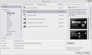
The Grid App is basically used for navigating between categories. User can search contents between categories for example, photo and video apps in Windows 8. In this article we will discuss basics about windows store Grid App. Lets start windows Store Grid Apps with some simple steps. Select  File->New Project->Windows Store Grid (XAML) under the "Windows Store" category.

Windows Store Grid(XAML)

After selecting "OK" button you have successfully created windows Store Grid Application and by-default application page will be opened. This app contains many files shown in Solution Explorer:

Windows Store Grid App(XAML) : Solution explorer

The Grid App template includes these .xaml files:

App.xaml, where you can change your application name also provides markup for the content Host.
GroupedItemsPage.xaml, it is the first page of the application. It contains Application name, Group name, Item name with sub-title. It enables a user to select an item to navigate to the full-page item view, or to select a group label to navigate to the group details page.
GroupedItemsPage.xaml in windows store Grid App

GroupDetailPage.xaml, It shows Group name with short description and also item name with short description, and select an item to navigate to the full-page item view.
GroupDetailPage.xaml in windows store Grid Apps

ItemDetailPage.xaml, which is the full-page view for an item.
ItemDetailPage.xaml in windows store Grid Apps

© Copyright 2013 Computer Programming | All Right Reserved