-->

Tuesday, November 26, 2013

How to add Styles to an HTML Document

Introduction

Rules can be applied to an HTML document in three ways, as inline style directions, as a style element embedded in the head section of HTML file and as an external file that can be either linked to or imported into document.

Inline styles

Style information can be added to an individual element by adding style attribute within HTML tag of that element. Value of style attribute is one or more standard style declarations, as shown here:

html page code

<!DOCTYPE html>
<html xmlns="http://www.w3.org/1999/xhtml">
<head>
 
    <title></title>
</head>
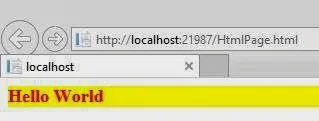
<body><div style="font-size: large; font-weight: bolder; font-style: normal; color: #FF0000; background-color: #FFFF00">
    Hello World
    </div>

</body>
</html>
Although a perfectly valid use of style information, inline styles are equivalent to <font> tag in the "pollute" document with presentation information. Style information is still tied to each individual content element and any changes would need to be made in every file, rather than globally. Inline styles are best used to override higher-level styles.

Embedded style sheet

A more compact method for adding style sheets is to embedding a style block, in the top of HTML document, using the <style> element. Following example shows sample rules embedded in a HTML document:

<!DOCTYPE html>
<html xmlns="http://www.w3.org/1999/xhtml">
<head>
    <style>
        h1 {
            font-size :x-large;
        }
        .inner {
            color:orange;
            background-color :green;
        }


    </style>
    <title></title>
</head>
<body><div class="inner">
    <h1>Hello World</h1>
    </div>

</body>
</html>

Output of the code is :


<style> element must be placed within <head> tag in the document. It is usually necessary to place HTML comment tags (<!-and->) around the <style> contents. This hides style information from browsers that don’t understand the <style> tag (otherwise, they could display the rules as text in browser window).

Currently, Cascading Style Sheets (CSS) are the style sheet language only, but the W3C has prepared for possibility of additional languages to be added in the future by providing type attribute within the <style> element. Only viable style type as of this writing is text/css. If the type attribute some browsers may ignore entire style sheet.

External style sheet 

The powerful way to use styles is to collect them all in a separate text document and create links to that document from all HTML pages in a site. In this way, you can make stylistic changes consistently across a whole site by editing style information in a single document. This is a powerful tool for large-scale sites.
These are two ways to refer to external style sheets from within an HTML document.
  1. Linking. The most standard and best-supported method is to create a link to that document using <link> tag  in <head> of document as shown here:
<link href="StyleSheet.css" rel="stylesheet" />


The rel attribute defines linked document’s relation to the current document- a “style sheet”. The href attribute provides URL to the file containing style sheet information.

Style sheet document is a simple text document that contains a collection of style sheet rules. It may not contain HTML tags, particularly structural tags that set up an HTML document (<head>, and <body>).

Style sheet. css file 

body {
    background-color :black;
}
.fontclass {
    color :white ;
    font-size :medium;
}

.html file

<!DOCTYPE html>
<html xmlns="http://www.w3.org/1999/xhtml">
<head>
    <link href="StyleSheet.css" rel="stylesheet" />
    <title></title>
</head>
<body><div class="fontclass">
    <h1>Hello World</h1>
    </div>

</body>
</html>

Output File 


2. Importing. An alternative to linking is to import external style sheets into <style> element using <style> the @import function as shown:

First Stylesheet.css file code 

@import url(StyleSheet2.css);

.fontclass {
    color :white ;
    font-size :medium;
}

Second Stylesheet.css file code

body {
    background-color :green;
}

Advantage to importing is, multiple style sheets can be applied to same Document (only one style sheet can be “linked” to a document). When additional import functions are added within <style> element, style information from the last file read (the one at the bottom of the list) will take precedence over previous ones.
Major drawback to import is limited browser support (it is currently only supported by Internet Explorer 4.0).

Monday, November 25, 2013

How to use HyperlinkButton with XAML in Windows 8 App Development

HyperLinkButton, used to open the specified URI in the default browser. URI can be specified in NavigateURI property of this button and it will launch that by clicking on that button. This button look like a text with underline. This button opens another page side by side in windows 8 app development.

Here's the XAML code which will create this type of button:

<Page
    x:Class="App4.MainPage"
    xmlns="http://schemas.microsoft.com/winfx/2006/xaml/presentation"
    xmlns:x="http://schemas.microsoft.com/winfx/2006/xaml"
    xmlns:local="using:App4"
    xmlns:d="http://schemas.microsoft.com/expression/blend/2008"
    xmlns:mc="http://schemas.openxmlformats.org/markup-compatibility/2006"
    mc:Ignorable="d">

    <Grid Background="{StaticResource ApplicationPageBackgroundThemeBrush}">
        
<HyperlinkButton x:Name="h1" NavigateUri="http://msdn.microsoft.com" Height="200" Width="257" Content="Microsoft Development Network" Margin="90,20,0,548" />


    </Grid>
</Page>

Here above the XAML code is so simple to read and understand. This code is using some mostly used properties described below:
  • x:Name: Specify the name of this button and used in code behind file.
  • NavigateURI: get or set the URI to navigate to when the button is clicked.
  • Height & Width: commonly used property by XAML elements. Read Height & Width in XAML.
  • Content: the text to be shown on the button.
  • Margin: specify the extra space to get placed around the outside edges. Read Margin in XAML.

Output

How to use HyperlinkButton in windows store app

How to use HyperlinkButton in windows store app

Saturday, November 23, 2013

How to make custom login control in asp.net programming

Introduction about security of your web page in asp.net programming

You have been familiarized with the process of creating websites of your choice. However , only creating a website is not enough, one have to secure from unauthorized users. Such users can access and steal vital information of other users or about secret info of website such as credit card numbers and email-ids.
Considering these factors, it is necessary to secure the websites from malicious users. To implement security, we must be able to track the user who visit the website and allow only authorized users to access the website resources. For tracking users, we need to collect some required information (such as name, email id, and contact no.) including username and password.

Users are required to furnish username and password to authenticate them as valid/registered users.To fulfill these tasks, we need to create a user interface for authenticating the user, and displaying the desired page based on the roles or rights given to the user. However, creating such forms or user interface with the help of standard ASP.NET Programming server controls is quite tedious and time consuming.
There is a fix login control in Visual Studio 2013 ASP programming, but it is attached with the in-built database. That's why we are designing custom login control for security of the web page, because through custom login control, programmer can check credentials from its own database.

 Follow some steps to make custom login control in asp.net programming

Step-1 : Design view of the asp program. We are designing something like the image shown.

custom login : Design view of the asp program.

Step-2: ASPX Code part in asp.net programming
<p>
        <h2>Login for security</h2></p>
    <asp:ValidationSummary ID="ValidationSummary1" runat="server" BackColor="#CCCC00" BorderColor="Black" BorderStyle="Solid" BorderWidth="4px" />
    <p>
        Enter member username :&nbsp;
        <asp:TextBox ID="usrtxt" runat="server" Width="182px"></asp:TextBox>
        <asp:RequiredFieldValidator ID="RequiredFieldValidator1" runat="server" ControlToValidate="usrtxt" ErrorMessage="Enter Username" ForeColor="Maroon">*</asp:RequiredFieldValidator>
    </p>
    <p>
        Enter&nbsp; member password : <asp:TextBox ID="pwd" runat="server" TextMode="Password" Width="182px"></asp:TextBox>
        <asp:RequiredFieldValidator ID="RequiredFieldValidator2" runat="server" ControlToValidate="usrtxt" ErrorMessage="Enter password" ForeColor="Maroon">*</asp:RequiredFieldValidator>
    </p>
    <p>
        <asp:Button ID="Button1" runat="server" Text="Member Login" OnClick="Button1_Click" />
    </p>
    <p>
        <asp:Label ID="Label1" runat="server"></asp:Label>


C# Code part
using System;
using System.Collections.Generic;
using System.Linq;
using System.Web;
using System.Web.UI;
using System.Web.UI.WebControls;
using System.Data.SqlClient;
using System.Data;
using System.Configuration;

public partial class welcome : System.Web.UI.Page
{
    SqlDataReader rd;
    protected void Page_Load(object sender, EventArgs e)
    {

    }
    protected void Button1_Click(object sender, EventArgs e)
    {
        bool flag=true ;
        using (SqlConnection con = new SqlConnection())
        {

        con.ConnectionString =ConfigurationManager .ConnectionStrings ["ConnectionString"].ToString ();
        con.Open ();
            using (SqlCommand cmd=new SqlCommand ())
            {
                cmd.CommandText ="select * from [Table]";
                cmd.Connection =con;
                rd=cmd.ExecuteReader (CommandBehavior .CloseConnection);
                while (rd.Read ())
{
                    if (rd["username"].ToString ().Equals(usrtxt .Text) && rd["password"].ToString ().Equals (pwd .Text))
                    {
                        flag =false ;
                        Session ["username"]=rd["username"].ToString ();
                        break ;

                    }
     
}
                if (flag ==true)
                    Label1 .Text ="No record found";
                else
                    Response .Redirect ("~/admin/securepage.aspx");

             
            }
        }
    }
}
Run this web page and the same design will be shown to you and you will be able to check the given credentials in your own database. The database name will be pass through the connection string used in the C# code.

Unformatted Input/Output Functions with Example: C Language

In our earlier post i have discussed about sequential and compound statements. Now in this post we will discuss about unformatted i/o functions. There are several standard library functions available in this category - those that can deal with a single character and those that can deal with a string of characters. The various unformatted input/output functions in C are shown below:

Unformatted Input/Output Functions with Example: C Language

getchar( ) and putchar( )

Even though getchar( ) and putchar( ) looks like functions, they are not. They are the macros that are used to read and display a character. The syntax to read a character shown below:

“ch = getchar( )” will reads a character from the keyboard and copy it into memory area which is identified by the variable ch. No arguments are required for this macro. Once the character is entered from the keyboard, the user has to press Enter key.

“putchar(ch)” outputs a character stored in a variable on the monitor. The variable should be passed as parameter as shown in the above syntax.

Example1
main()
{
 char ch;
 clrscr();
 ch = getchar();
 putchar(ch);
 getch();
}

getch(), getche() and putch()

The functions getch() and getche() are used to read a character from the keyboard, similar to getchar(). Both functions don’t need a return key pressed to terminate the reading of a character. A character entered will itself terminates reading. 

In case of getch(), the character entered is not displayed or echoed on the screen, whereas in getche(), the character entered is echoed or displayed on the screen. Syntax for both the macros
ch = getch();            /*Typed character will not be displayed on the screen*/
ch = getche();            /*Typed character will be displayed on the screen*/

Now, we have to display the inputted character on the screen, putch() macro is introduced.
“putch(ch)” This function outputs a character stored in the memory, on the monitor. The variable should be passed as parameter to the functions. In the above syntax ‘ch’ is used as an argument and its value is displayed on the screen.
Example2:
main()
{
  char ch;
  clrscr();
  ch = getche();
  putch(ch);
  getch();
}

gets() and puts()

These functions are used to read a set of characters (string) from the keyboard and display a set of characters (string) on the screen.
char str[5];
gets(str);
        /* Reads a set of characters into memory area str */
puts(str);         /* Displays a set of characters from memory area str */
Example3
main()
{
  char str[10];
  clrscr();
  gets(str);
  puts(str);
  getch();
}

Formatted I/O Functions

Thursday, November 21, 2013

Windows Store App : How to use Grid in XAML

Introduction

By-default a Grid element has one row and one column i.e. a single cell, any control placed inside the Grid will be placed in this cell. Lets see the below simple XAML code where a textbox is placed in the first row and first column. Programmer is not specifying here, but it have value of Grid.Row as well as Grid.Column property to zero.

<Grid Background="{StaticResource ApplicationPageBackgroundThemeBrush}">
        <TextBlock Text="Hello World" />
</Grid>

How to Insert multiple Rows and Columns in Grid

Step-1 : Create <Grid.RowDefinitions> and <Grid.ColumnDefinitions > inside the Grid.

  <Grid Background="{StaticResource ApplicationPageBackgroundThemeBrush}">
        <Grid.RowDefinitions>              
        </Grid.RowDefinitions>

        <Grid.ColumnDefinitions >             
        </Grid.ColumnDefinitions>

</Grid>
Step-2: Lets create Three rows and three columns, by adding three RowDefinition and ColumnDefinition child as in below code.

<Grid Background="{StaticResource ApplicationPageBackgroundThemeBrush}">
        <Grid.RowDefinitions>   
            <RowDefinition Height="150"/>
            <RowDefinition Height="Auto" />
            <RowDefinition Height="*" />
           
        </Grid.RowDefinitions>
        <Grid.ColumnDefinitions >          
            <ColumnDefinition Width="*" />
            <ColumnDefinition Width="*" />
            <ColumnDefinition Width="*" />
        </Grid.ColumnDefinitions>

</Grid>

Here we have three rows and three column. Every row contains height attribute and column contains width attribute.The first row's height, expressed as an integer value for a pixel count. In the second row's height, described by a literal "Auto" or you can say height will adjust according to the content which will placed inside the grid. In third row's height, described by the asterisk character(*)  means you can say the last row will take remaining space of the grid.

How to place controls in rows and columns 

Generally grid is used when we are placing elements in no. of rows and columns. Suppose we want to move control to the second row and second column. To do that we have to set the value of Grid.Row and Grid.Column attribute of the respective element. Review the following XAML:

<Grid Background="{StaticResource ApplicationPageBackgroundThemeBrush}">
        <Grid.RowDefinitions>   
            <RowDefinition Height="150"/>
            <RowDefinition Height="Auto" />
            <RowDefinition Height="*" />
           
        </Grid.RowDefinitions>
        <Grid.ColumnDefinitions >          
            <ColumnDefinition Width="*" />
            <ColumnDefinition Width="*" />
            <ColumnDefinition Width="*" />
        </Grid.ColumnDefinitions>
        <TextBlock x:Name="firstBlock" Text=" Hello World" Grid.Row="1" Grid.Column="1" />
    </Grid>

Look out the above code, i have set the value of Grid.Row and Grid.Column to 1 for textbox element. By this it will placed in the second row and second column.

Design view of the code

Grid row definition and column definition in xaml: Windows Store App

Here your snap simplifies relation between TextBlock and Grid. Lets take a simple theory to understand how to define TextBlock outside the Grid.RowDefinitions and Grid.ColumnDefinitions.

Suppose you have three fruits apple, grapes and orange now you want to place all of them in individual row and column. Then you can simply place these items in the specified rows and column using Grid.Row and Grid.Column attribute.
© Copyright 2013 Computer Programming | All Right Reserved