-->

Monday, April 14, 2014

StackPanel Overview in WPF

Layouts in WPF

WPF layout, a mostly used component of an application, is basically used to arranging controls on fixed pixels. Users can not resize the places which are placed in these layouts. There are five built-in panels i.e. Stack Panel, Canvas, Wrap Panel, Grid and Dock Panel resides in System.Windows.Controls namespace.


Stack Panel:

A very popular panel because of its simplicity and usefulness. As its name suggests it simply place its children into a stack. This panel is used in the same way as stacks in C programming. It places its children from the right/bottom most side, previous element will move when new one comes, and so on.


StackPanel in WPF

By default the orientation property of any stackpanel is vertical, if we want to show our contents in horizontal then we have to change the orientation of stackpanel. As in above diagram I have placed three button in both of the views one by one. By using simple code in xaml I can use a stack panel as in above window.
<StackPanel>
<Button Content="First " Width="70"></Button>
<Button Content="Second " Width="70"></Button>
<Button Content="Third " Width="70"></Button>
</StackPanel>
<StackPanel Orientation="Horizontal">
<Button Content="First " Height="50"></Button>
<Button Content="Second " Height="50"></Button>
<Button Content="Third " Height="50"></Button>
</StackPanel>
There are some cases in which we have to use nested stack panel like to show a person’s image and some information. 
<StackPanel>
<Image Source="...." Name="image"></Image>
<StackPanel >
<Label Content="Name"></Label>
<Label Content="Age"></Label>
<Label Content="Father Name"></Label>
</StackPanel>
</StackPanel>
Wrap panel

How to Use Checkbox in WPF

Checkbox is a GUI element that permits the user to make a binary choice i.e. user may have to answer yes or no. Now a days programming have a new option to set the value to null. It means checkbox may be used as a three state which are checked, unchecked and intermediate.

The following screenshot shows three states of a checkbox

CheckBox control in WPF

In the above image all the three checkboxes have IsThreeState property to true and some more properties like the following code in xaml:
<CheckBox IsThreeState="True" Content="Checked" IsChecked="True"></CheckBox>
<CheckBox IsThreeState="True" Content="UnChecked" IsChecked="False"></CheckBox>
<CheckBox IsThreeState="True" Content="Intermediate" IsChecked="{x:Null}"></CheckBox>

IsChecked property is used to set the state of checkbox. You may have three options for these state values as I have used in above code snippet. Checkbox is mostly used in objective type answers or we can say Boolean type answers. Gender value may also be store through checkbox control.


We can perform the desired function, when the checkbox is checked or unchecked using the events respectively.
private void Checkbox_Checked(object sender, RoutedEventArgs e)
{
MessageBox.Show("Checkbox Checked");
}

private void Checkbox_Unchecked(object sender, RoutedEventArgs e)
{
MessageBox.Show("Checkbox Checked");
}
Each time when a checkbox is checked or unchecked, a message will be shown defined in the above code snippets. To add a checkbox dynamically with checked property true we can write the following code:

CheckBox chkBox = new CheckBox();
chkBox.Name = "checkBox";
chkBox.Content = "Checked";
chkBox.IsChecked = true;
chkBox.IsThreeState = true;
this.Content = chkBox;
The above code will replace all the content of the window with this checkbox. So if you want to add this to any other container like stackpanel or anything, then you have to add this as a children of that container.

Monday, November 25, 2013

How to use HyperlinkButton with XAML in Windows 8 App Development

HyperLinkButton, used to open the specified URI in the default browser. URI can be specified in NavigateURI property of this button and it will launch that by clicking on that button. This button look like a text with underline. This button opens another page side by side in windows 8 app development.

Here's the XAML code which will create this type of button:

<Page
    x:Class="App4.MainPage"
    xmlns="http://schemas.microsoft.com/winfx/2006/xaml/presentation"
    xmlns:x="http://schemas.microsoft.com/winfx/2006/xaml"
    xmlns:local="using:App4"
    xmlns:d="http://schemas.microsoft.com/expression/blend/2008"
    xmlns:mc="http://schemas.openxmlformats.org/markup-compatibility/2006"
    mc:Ignorable="d">

    <Grid Background="{StaticResource ApplicationPageBackgroundThemeBrush}">
        
<HyperlinkButton x:Name="h1" NavigateUri="http://msdn.microsoft.com" Height="200" Width="257" Content="Microsoft Development Network" Margin="90,20,0,548" />


    </Grid>
</Page>

Here above the XAML code is so simple to read and understand. This code is using some mostly used properties described below:
  • x:Name: Specify the name of this button and used in code behind file.
  • NavigateURI: get or set the URI to navigate to when the button is clicked.
  • Height & Width: commonly used property by XAML elements. Read Height & Width in XAML.
  • Content: the text to be shown on the button.
  • Margin: specify the extra space to get placed around the outside edges. Read Margin in XAML.

Output

How to use HyperlinkButton in windows store app

How to use HyperlinkButton in windows store app

Thursday, November 21, 2013

Windows Store App : How to use Grid in XAML

Introduction

By-default a Grid element has one row and one column i.e. a single cell, any control placed inside the Grid will be placed in this cell. Lets see the below simple XAML code where a textbox is placed in the first row and first column. Programmer is not specifying here, but it have value of Grid.Row as well as Grid.Column property to zero.

<Grid Background="{StaticResource ApplicationPageBackgroundThemeBrush}">
        <TextBlock Text="Hello World" />
</Grid>

How to Insert multiple Rows and Columns in Grid

Step-1 : Create <Grid.RowDefinitions> and <Grid.ColumnDefinitions > inside the Grid.

  <Grid Background="{StaticResource ApplicationPageBackgroundThemeBrush}">
        <Grid.RowDefinitions>              
        </Grid.RowDefinitions>

        <Grid.ColumnDefinitions >             
        </Grid.ColumnDefinitions>

</Grid>
Step-2: Lets create Three rows and three columns, by adding three RowDefinition and ColumnDefinition child as in below code.

<Grid Background="{StaticResource ApplicationPageBackgroundThemeBrush}">
        <Grid.RowDefinitions>   
            <RowDefinition Height="150"/>
            <RowDefinition Height="Auto" />
            <RowDefinition Height="*" />
           
        </Grid.RowDefinitions>
        <Grid.ColumnDefinitions >          
            <ColumnDefinition Width="*" />
            <ColumnDefinition Width="*" />
            <ColumnDefinition Width="*" />
        </Grid.ColumnDefinitions>

</Grid>

Here we have three rows and three column. Every row contains height attribute and column contains width attribute.The first row's height, expressed as an integer value for a pixel count. In the second row's height, described by a literal "Auto" or you can say height will adjust according to the content which will placed inside the grid. In third row's height, described by the asterisk character(*)  means you can say the last row will take remaining space of the grid.

How to place controls in rows and columns 

Generally grid is used when we are placing elements in no. of rows and columns. Suppose we want to move control to the second row and second column. To do that we have to set the value of Grid.Row and Grid.Column attribute of the respective element. Review the following XAML:

<Grid Background="{StaticResource ApplicationPageBackgroundThemeBrush}">
        <Grid.RowDefinitions>   
            <RowDefinition Height="150"/>
            <RowDefinition Height="Auto" />
            <RowDefinition Height="*" />
           
        </Grid.RowDefinitions>
        <Grid.ColumnDefinitions >          
            <ColumnDefinition Width="*" />
            <ColumnDefinition Width="*" />
            <ColumnDefinition Width="*" />
        </Grid.ColumnDefinitions>
        <TextBlock x:Name="firstBlock" Text=" Hello World" Grid.Row="1" Grid.Column="1" />
    </Grid>

Look out the above code, i have set the value of Grid.Row and Grid.Column to 1 for textbox element. By this it will placed in the second row and second column.

Design view of the code

Grid row definition and column definition in xaml: Windows Store App

Here your snap simplifies relation between TextBlock and Grid. Lets take a simple theory to understand how to define TextBlock outside the Grid.RowDefinitions and Grid.ColumnDefinitions.

Suppose you have three fruits apple, grapes and orange now you want to place all of them in individual row and column. Then you can simply place these items in the specified rows and column using Grid.Row and Grid.Column attribute.

Tuesday, November 19, 2013

How to change Application name in Windows Store Grid App

Introduction

In our previous article, we have studied about Windows Store Grid App. In this article we will learn about App.xaml file and their behaviors also take a simple example to change Application name.

Pre-requisite

  • You need windows 8 SDK
  • You need developer license

General Structure of App.xaml file

<Application
    x:Class="FirstGridApplication.App"
    xmlns="http://schemas.microsoft.com/winfx/2006/xaml/presentation"
    xmlns:x="http://schemas.microsoft.com/winfx/2006/xaml"
    xmlns:local="using:FirstGridApplication"
    xmlns:localData="using:FirstGridApplication.Data">

    <Application.Resources>
        <ResourceDictionary>
            <ResourceDictionary.MergedDictionaries>

                <!--
                    Styles that define common aspects of the platform look and feel
                    Required by Visual Studio project and item templates
                 -->
                <ResourceDictionary Source="Common/StandardStyles.xaml"/>
            </ResourceDictionary.MergedDictionaries>

            <!-- Application-specific resources -->

            <x:String x:Key="AppName">FirstGridApplication</x:String>
        </ResourceDictionary>
    </Application.Resources>

</Application>

If you want to change Application name in Grid App then you should go for  App.xaml file and change in markup as specified in below XAML code

 <x:String x:Key="AppName">FirstGridApplication</x:String>

First Output Page
How to change Application name in Windows Store Grid App

<x:String x:Key="AppName">My Application</x:String>

After change Output will become

How to change Application name in Windows Store Grid App


Monday, November 18, 2013

Getting Started with Windows Store Grid App (XAML)

Introduction

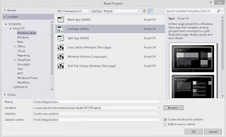
The Grid App is basically used for navigating between categories. User can search contents between categories for example, photo and video apps in Windows 8. In this article we will discuss basics about windows store Grid App. Lets start windows Store Grid Apps with some simple steps. Select  File->New Project->Windows Store Grid (XAML) under the "Windows Store" category.

Windows Store Grid(XAML)

After selecting "OK" button you have successfully created windows Store Grid Application and by-default application page will be opened. This app contains many files shown in Solution Explorer:

Windows Store Grid App(XAML) : Solution explorer

The Grid App template includes these .xaml files:

App.xaml, where you can change your application name also provides markup for the content Host.
GroupedItemsPage.xaml, it is the first page of the application. It contains Application name, Group name, Item name with sub-title. It enables a user to select an item to navigate to the full-page item view, or to select a group label to navigate to the group details page.
GroupedItemsPage.xaml in windows store Grid App

GroupDetailPage.xaml, It shows Group name with short description and also item name with short description, and select an item to navigate to the full-page item view.
GroupDetailPage.xaml in windows store Grid Apps

ItemDetailPage.xaml, which is the full-page view for an item.
ItemDetailPage.xaml in windows store Grid Apps

Friday, October 11, 2013

How to Use Images in Treeview: WPF

Image control can be placed in any other control such like Treeview, Toolbar control or any other controls. The images can be stored in your solution files. To place an image in Treeview control using following simple steps.

Place a stackpanel with horizontal orientation and look like following structure:
 <StackPanel Orientation="Horizontal" Height="30">
<Label Content="first"></Label>
<Image Source="buttonImage.png"></Image>
</StackPanel>

The XAML code will place a label and an image in a stack panel. Now to use this in treeview control just place it in between the treeview item code.
<TreeView HorizontalAlignment="Left" VerticalAlignment="Top" Margin="5">
<TreeViewItem Header="Item1">
<StackPanel Orientation="Horizontal" Height="30">
<Label Content="first"></Label>
<Image Source="buttonImage.png"></Image>
</StackPanel>
</TreeViewItem>
</TreeView>

A single treeview item will be placed in the WPF window. Now write the following code to place three treeview items each having an image:
<TreeView HorizontalAlignment="Left" VerticalAlignment="Top" Margin="5">
<TreeViewItem Header="Item1">
<StackPanel Orientation="Horizontal" Height="30">
<Label Content="first"></Label>
<Image Source="buttonImage.png"></Image>
</StackPanel>
</TreeViewItem>
<TreeViewItem Header="Item2">
<StackPanel Orientation="Horizontal" Height="30">
<Label Content="second"></Label>
<Image Source="image1.png"></Image>
</StackPanel>
</TreeViewItem>
<TreeViewItem Header="Item3">
<StackPanel Orientation="Horizontal" Height="30">
<Label Content="third"></Label>
<Image Source="image2.png"></Image>
</StackPanel>
</TreeViewItem>
</TreeView>

Run the project and expand each of the node of treeview, each node have its label and an image as shown in the following image:

How to use images in Treeview control WPF XAML

See Also: Place an Image in Toolbar

Introduction of WPF TreeView Control

Treeview control is used to display our data in hierarchical form, where some of the nodes are parent and some of them are children of their parents. In the left side of windows explorer there is a treeview containing some libraries, or our computer shortcuts and some favourites.

The parent node can be expanded or collapsed by the user. A simple treeview containing some nodes can be designed by the following XAML code:


<TreeView HorizontalAlignment="Left" VerticalAlignment="Top">
<TreeViewItem Header="Item1"/>
<TreeViewItem Header="Item2"/>
<TreeViewItem Header="Item3"/>
<TreeViewItem Header="Item4"/>
</TreeView>

The code will place a treeview contains four items as described in above code. The code specifies that the treeview will placed in the left and top of the window having margin of 5 points as shown in the following image:

How to use Treeview and add some children in WPF XAML

Now we have to add some children for the treeview item added above. Write the following XAML code:
<TreeView HorizontalAlignment="Left" VerticalAlignment="Top" Margin="5">
<TreeViewItem Header="Item1">
<TreeViewItem Header="Child 1"></TreeViewItem>
<TreeViewItem Header="Child 2"></TreeViewItem>
</TreeViewItem>
<TreeViewItem Header="Item2">
<TreeViewItem Header="Child 1"></TreeViewItem>
<TreeViewItem Header="Child 2"></TreeViewItem>
</TreeViewItem>
<TreeViewItem Header="Item3">
<TreeViewItem Header="Child 1"></TreeViewItem>
<TreeViewItem Header="Child 2"></TreeViewItem>
</TreeViewItem>
</TreeView>

Run the project and it will show three parent nodes, each contains two children, as shown in the following image:

How to use Treeview and add some children in WPF XAML

Like above children we can add more children to the parent node and a children can also have its children. The same process will follow up to add nested nodes.

See Also: How to use Treeview in Windows Forms
© Copyright 2013 Computer Programming | All Right Reserved