-->

Wednesday, October 28, 2015

WPF menu bar with dockpanel | additem | Image | Icon | Checkbox | Click event

In this article, I will teach you, how to add WPF menu bar at top position in window, Add items in it, add image as icon in it, also handle click event on each items of it. I explained, how to add items with underline.

<Window x:Class="WpfApplication5.MainWindow"
xmlns="http://schemas.microsoft.com/winfx/2006/xaml/presentation"
xmlns:x="http://schemas.microsoft.com/winfx/2006/xaml"
<DockPanel>
Title="MainWindow" Height="350" Width="525"> <Grid> <Menu DockPanel.Dock="Top">
<MenuItem Header=" second child"/>
<MenuItem Header="_First Parent"> <MenuItem Header="New" Command="New"/>
</MenuItem.Icon>
<MenuItem Header="Third child with image"> <MenuItem.Icon> <Image Source="mango.png"/>
<MenuItem Header="Second first child" IsCheckable="True" IsChecked="True" Click="MenuItem_Click"/>
</MenuItem> </MenuItem> <MenuItem Header="Second Parent"> </MenuItem> </Menu> </DockPanel>
</Window>
</Grid>

The above-mentioned XAML code define, a menu control inside in DockPanel control at top position. The first item in the menu works as container. In the first menu item, we have three child items. First child item contains shortcut key by using command attribute. Second child item appears as simple text, last item contain image. Similarly add another menu item in the menu control for making second parent item with click event. 


  private void MenuItem_Click(object sender, RoutedEventArgs e)  
     {  
       MessageBox.Show("second parent first child clicked");  
     }  
When, I press child item of second parent item then appear a message box on the screen.
Code generates the following output:

WPF menu bar with dockpanel | additem | Image | Icon | Checkbox | Click event

Example of Login form in WPF

Today, I will teach you, how to design login form in WPF. Also, I will teach you, how it will work. In this example, I will take two text boxes, two Text Blocks and one button control from ToolBox. Now, create a database table with some following fields:

 CREATE TABLE [dbo].[users] (  
   [Id]    INT      NOT NULL IDENTITY,  
   [username] NVARCHAR (50) NULL,  
   [password] NVARCHAR (50) NULL,  
   PRIMARY KEY CLUSTERED ([Id] ASC)  
 );  

In this database table, I have three column, first column is automatic incremented by one.

 <Window x:Class="WpfApplication5.additemwpflistview"  
     xmlns="http://schemas.microsoft.com/winfx/2006/xaml/presentation"  
     xmlns:x="http://schemas.microsoft.com/winfx/2006/xaml"  
     Title="additemwpflistview" Height="300" Width="300">  
   <Grid>  
     <TextBlock HorizontalAlignment="Left" Margin="10,41,0,0" TextWrapping="Wrap" Text="UserName" VerticalAlignment="Top"/>  
     <TextBox Name="t1" HorizontalAlignment="Left" Height="23" Margin="94,41,0,0" TextWrapping="Wrap" Text="" VerticalAlignment="Top" Width="120"/>  
     <TextBlock HorizontalAlignment="Left" Margin="15,91,0,0" TextWrapping="Wrap" Text="Password" VerticalAlignment="Top"/>  
     <TextBox Name="t2" HorizontalAlignment="Left" Height="23" Margin="94,84,0,0" TextWrapping="Wrap" Text="" VerticalAlignment="Top" Width="120"/>  
     <Button Content="Login" HorizontalAlignment="Left" Margin="94,130,0,0" VerticalAlignment="Top" Width="75" Click="Button_Click"/>  
   </Grid>  
 </Window>  

Note: Before doing all such things, must to add EDMX file in the project.


  private void Button_Click(object sender, RoutedEventArgs e)  
     {  
       DatabaseEntities dbe = new DatabaseEntities();  
       if(t1.Text!= string.Empty || t2.Text!=string.Empty)  
       {  
         var users = dbe.users.FirstOrDefault(a => a.username.Equals(t1.Text));  
         if(users!=null)  
         {  
           if(users.password.Equals(t2.Text))  
           {  
             WPFListview l1 = new WPFListview();  
             l1.ShowDialog();  
           }  
         }  
       }  
     }  

Code generates the following output:

Example of Login form in WPF


Monday, October 26, 2015

WPF Listview formatting, styling

In this article, I will teach you, how to change Background color, foreground color, font style, and many more things. I explained already many more things about WPF Listview like
  1. How to add items in it using XAML code
  2. How to bind the WPF Listview.view from Gridview.
  3. WPF Listview binding from EDMX file 
  4. Binding it with List of string type.
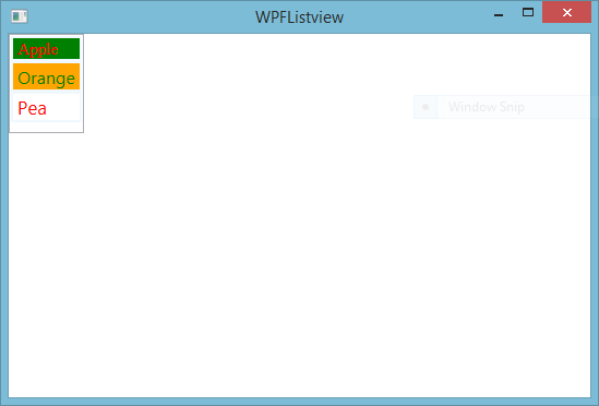
Also covered many more articles, which is related to styling and formatting. You can see my video article for Learn WPF styling using static as well as dynamic. Today, I will put some styles in XAML code. Let's see

   <ListView Name="list1" HorizontalAlignment="Left" VerticalAlignment="Top">  
       <ListViewItem FontFamily="Times New Roman" FontSize="15" Foreground="Red" Background="Green" BorderBrush="AliceBlue" BorderThickness="2">Apple</ListViewItem>  
       <ListViewItem FontSize="16" Foreground="Green" Background="orange" BorderBrush="AliceBlue" BorderThickness="2">Orange</ListViewItem>  
       <ListViewItem FontSize="17" Foreground="Red" Background="White" BorderBrush="AliceBlue" BorderThickness="2">Pea</ListViewItem>  
       <ListBoxItem>  
         </ListBoxItem>  
     </ListView>  

Code generates the following output

WPF Listview formatting, styling

Sunday, October 25, 2015

WPF Listview with ItemTemplate binding using EDMX file

In this article, I will teach you, how to bind WPF Listview with ItemTemplate using EDMX file. Also, I will give you an example of it. So far we have discussed basics of WPF Listview control. Let's see, what's are covered about WPF:

  1. WPF Listview binding with Gridview cell template using EDMX file
  2. WPF LISTVIEW BINDING USING EDMX FILE
  3. wpf listview bind with list of string type
Let's see the example of this example:

 <Window x:Class="WpfApplication5.MainWindow"  
     xmlns="http://schemas.microsoft.com/winfx/2006/xaml/presentation"  
     xmlns:x="http://schemas.microsoft.com/winfx/2006/xaml"  
     Title="MainWindow" Height="350" Width="525">  
   <Grid>  
     <ListView Name="list1">  
       <ListView.ItemTemplate>  
         <DataTemplate>  
           <WrapPanel>  
             <TextBlock Text="Id="/>  
             <TextBlock Text="{Binding Id}"/>  
             <TextBlock Text=","/>  
             <TextBlock Text="Name="/>  
             <TextBlock Text="{Binding Emp_Name}"/>  
           </WrapPanel>  
         </DataTemplate>  
       </ListView.ItemTemplate>  
     </ListView>  
   </Grid>  
 </Window>  

Before doing code in code-behind file, add EDMX file in project.

  public partial class MainWindow : Window  
   {  
     public MainWindow()  
     {  
       InitializeComponent();  
       loaditemTemplate();  
     }  
     private void loaditemTemplate()  
     {  
       DatabaseEntities dbe = new DatabaseEntities();  
       list1.ItemsSource = dbe.Employees.ToList();  
     }  
   }  

Code generates the following output

WPF Listview with ItemTemplate binding using EDMX file

Saturday, October 24, 2015

First 3 WPF videos, start your learning

I will give you a WPF videos series. If you watch each then you do start your career with WPF. Through WPF videos, you can design light weight application. Let's start step by step. In first video you learn about basics of WPF projects, let's see


In this video, I will teach you many more things about WPF start like

  1. How to start Visual Studio for WPF application.
  2. Create new project for WPF, select C# language in left pane, select WPF application in middle pane.
  3. First-page name of the default window is MainWindow.xaml. It contains default WPF Grid control.
  4. Add a TextBlock with Text property inside WPF grid.
  5. Learn, How to run WPF application.
Now, come to next video of WPF videos series. First of all, I will teach you about WPF panels. So, here, I share you a video of stack panel.

Check it, what is inside. Drag WPF stack panel control from ToolBox, drop it in Window. When we add it in Window then XAML automatically update with stack panel code. Here, we have HorizontalAlignment=left, Height="100", width="100", verticalAlignement="Top".  You can resize it by all corners using design window. Now, you can add buttons and other controls inside stack panel. A button control has content property, which is used as a label. By using orientation property, we can set controls alignment either horizontally and vertically. By using this video also, I explain you, how to add image in stack panel. Stack panel contains another stack panel. Now, come to next video of WPF videos series.

Grid panel is also a container. It has two things that are RowDefinition and ColumnDefinition. WPF grid is the most popular control in presentation foundation. By using this, we can add controls in it a specific cell  of Rows and columns. If, your controls are outside from grid then you can place it in WPF Grid, watch this video and learn, how to place control inside WPF Grid.

Friday, October 23, 2015

WPF Listview items with images

WPF ListView is a container of other single controls. I mean to say that you can put other single control in it. Other controls considered as a Listview item. You can put only simple single string or control like TextBlock. Lets to check the demo of this line.

1:     <ListView>  
2:        <ListViewItem>  
3:          <TextBlock Text="Fruits"/>  
4:        </ListViewItem>  
5:        <ListViewItem>  
6:          Vegetables  
7:        </ListViewItem>  
8:      </ListView>  

In this code, we have both string as well control. You can take other containers in it like StackPanel etc. as a ListView Item. In previous example, i taken Gridview control as view of Listview. Now, i will take image with Text in it as a single WPF Listview item.

1:  <ListView>  
2:        <ListViewItem>  
3:          <StackPanel Orientation="Horizontal">  
4:            <Image Source="apple.png"/>  
5:            <TextBlock Text="Apple"/>  
6:          </StackPanel>         
7:        </ListViewItem>  
8:        <ListViewItem>  
9:          <StackPanel Orientation="Horizontal">  
10:            <Image Source="mango.png"/>  
11:            <TextBlock Text="mango"/>  
12:          </StackPanel>  
13:        </ListViewItem>  
14:        <ListViewItem>  
15:          <StackPanel Orientation="Horizontal">  
16:            <Image Source="grapes.png"/>  
17:            <TextBlock Text="grapes"/>  
18:          </StackPanel>  
19:        </ListViewItem>  
20:      </ListView>  
Copy this code and paste into your WPF window, before doing this, please add three image into your project,. These three images names are apple.png, mango.png and grapes.png.

WPF Listview items with images


ASP.NET FILEUPLOAD CONTROL CHANGE BACKGROUND COLOR USING CODE

Each control in ASP.NET ToolBox of visual studio, treat as a class. Property window shows the behavior of their controls also contains some common property, such as back-color, border color etc. Now in this article, we will take a simple example to change the background color of ASP.NET file upload control.

Description
I explained, ASP.NET FILEUPLOAD CONTROL change border color, File upload control enable/disable

Source code


 <%@ Page Language="C#" AutoEventWireup="true" CodeFile="fileupload_backcolor.aspx.cs" Inherits="fileupload_backcolor" %>  
 <!DOCTYPE html>  
 <html xmlns="http://www.w3.org/1999/xhtml">  
 <head runat="server">  
   <title></title>  
 </head>  
 <body>  
   <form id="form1" runat="server">  
   <div>  
     Enter Alpha color :  
     <asp:TextBox ID="TextBox1" runat="server" Width="202px"></asp:TextBox>  
     <br />  
     Enter Red Color :  
     <asp:TextBox ID="TextBox2" runat="server" Width="202px"></asp:TextBox>  
     <br />  
     Enter Green Color:  
     <asp:TextBox ID="TextBox3" runat="server" Width="202px"></asp:TextBox>  
     <br />  
     Enter Blue Color&nbsp;&nbsp; :  
     <asp:TextBox ID="TextBox4" runat="server" Width="202px"></asp:TextBox>  
     <br />  
     <br />  
     <asp:Button ID="Button1" runat="server" OnClick="Button1_Click" Text="Change Fileupload background color" Width="260px" />  
     <br />  
     <br />  
   </div>  
     <asp:FileUpload ID="FileUpload1" runat="server" Height="51px" Width="311px" />  
   </form>  
 </body>  
 </html>  

Code Behind Code

 using System;  
 using System.Collections.Generic;  
 using System.Linq;  
 using System.Web;  
 using System.Web.UI;  
 using System.Web.UI.WebControls;  
 public partial class fileupload_backcolor : System.Web.UI.Page  
 {  
   protected void Page_Load(object sender, EventArgs e)  
   {  
   }  
   protected void Button1_Click(object sender, EventArgs e)  
   {  
     int alpha = int.Parse(TextBox1 .Text);  
     int red = int.Parse(TextBox2.Text);  
     int green = int.Parse(TextBox3.Text);  
     int blue = int.Parse(TextBox4.Text);  
     FileUpload1.BackColor = System.Drawing.Color.FromArgb(alpha, red, green, blue);  
   }  
 }  

Code Generate the following output

programmatically change background color of fileupload control in ASP.NET

programmatically change background color of fileupload control in ASP.NET

In this example, we are taking four textboxes, one button, one file upload control. Using text box we can input the color code value and pass these values into the FromArgb ( ) method. This example is basically designed for users, who want to change the color of file upload control at run time.
© Copyright 2013 Computer Programming | All Right Reserved